Chapter 6 Data Visualization with ggplot
Data visualization is a critical aspect of statistics and data science. A good visualization shows the essence of the underlying data in a way that is immediately understandable. Visualization can also provide insights into the data that are very hard to get by simply looking at the data itself.
In this chapter, we introduce the package ggplot2, which provides easy ways to create plots that are better looking than the base R plots. There will often be much fine tuning required for a publication quality plot, whether you are using base R or ggplot2, and we do not go into the details there. In order to get a good visualization, it is often necessary to apply the techniques from Chapter 5 to get the data into the correct format for ggplot2 to use, and an understanding of the dplyr tools introduced in that chapter will be assumed throughout this chapter.
6.1 Scatterplots and Boxplots
6.1.1 Scatterplots
We start by looking at a built-in data set, CO2. This data set gives the carbon dioxide uptake of six plants from Quebec and six plants from Mississippi. The uptake is measured at different levels of carbon dioxide concentration, and half of the plants of each type were chilled overnight before the experiment was conducted.

The function ggplot takes as its first argument the data frame that we are working with, and as its second argument the aesthetics mappings between variables and visual properties. In this case, we are telling ggplot that the aesthetic “x-coordinate” is to be associated with the variable conc, and the aesthetic “y-coordinate” is to be associated to the variable uptake. Let’s see what that command does all by itself:
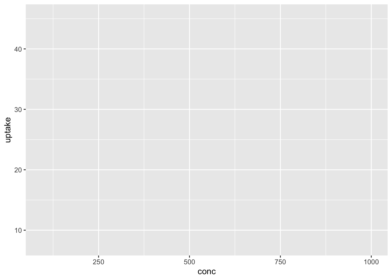
ggplot has set up the x-coordinates and y-coordinates for conc and uptake. Now, we just need to tell it what we want to do with those coordinates. That’s where geom_point comes in. The function geom_ point() inherits the x and y coordinates from ggplot, and plots them as points. geom_smooth() would fit a curve to the data.
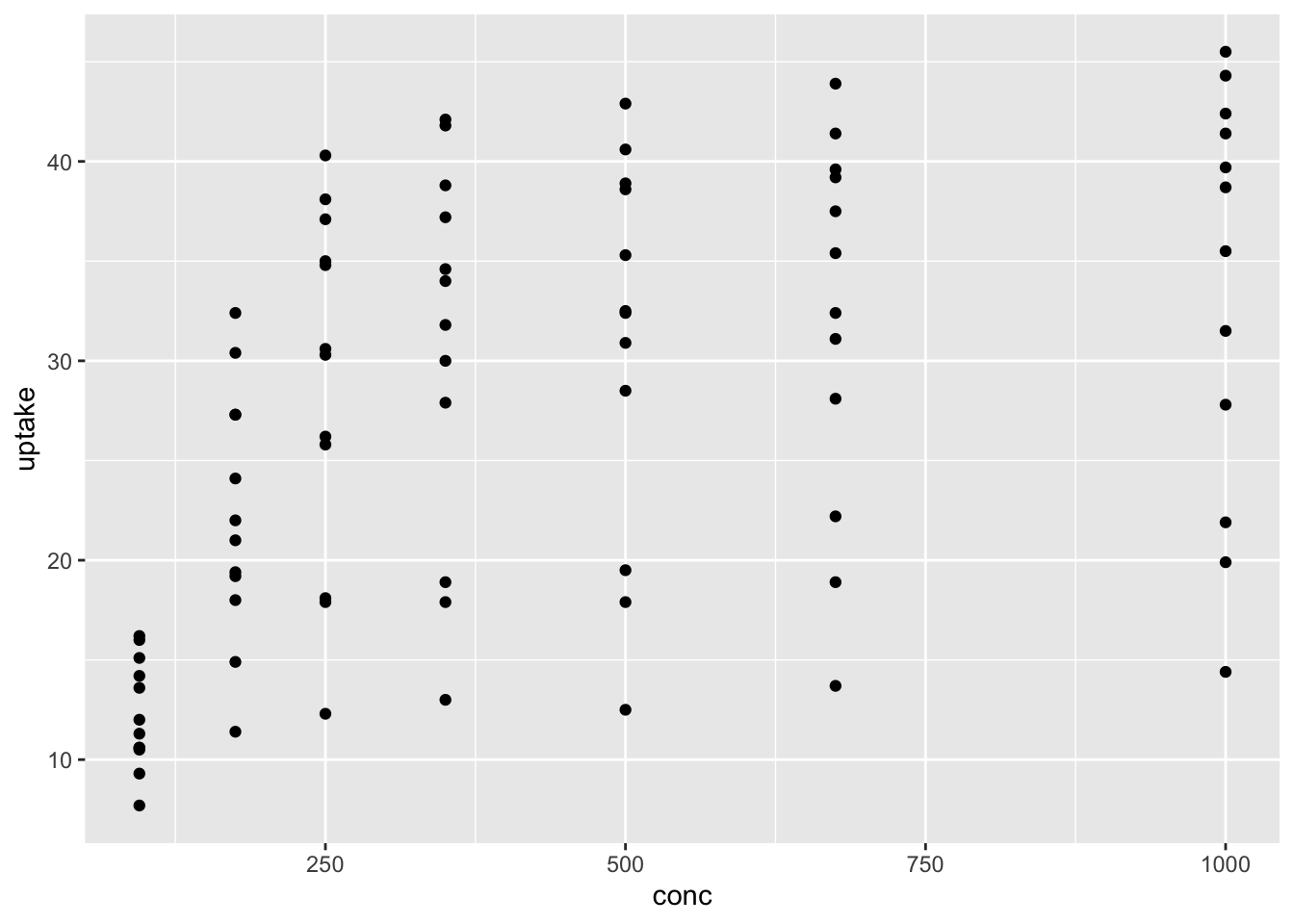
## `geom_smooth()` using method = 'loess' and formula 'y ~ x'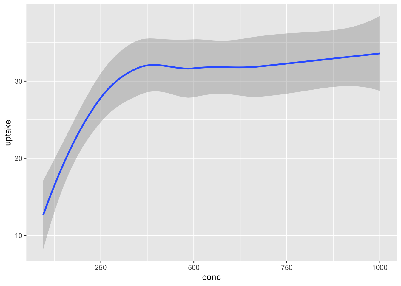
Notice that geom_smooth produced a message describing exactly how it went about smoothing the data. That can be helpful, but this book will suppress
those messages from here on.
We can combine geoms, so that multiple geoms appear on the same plot. For example, we might want to see the data points and the fitted curve on the same plot.
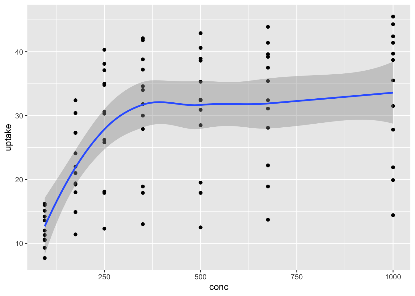
Next, we note that x and y are not the only aesthetics that you can associate to a variable! Looking at the help page for geom_point, we see that the following aesthetics are understood.
- x
- y
- alpha
- color
- fill
- group
- shape
- size
- stroke
Probably the most common addition is color. Let’s color the points according to whether they are from Mississippi or Quebec.
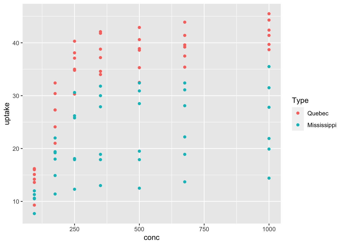
That plot is very useful! We see that the Quebecois plants have a larger uptake of CO2 at each concentration level than do the Mississippians. We will not go through all of the various aesthetics for each geom, but recommend that you play around with the aesthetics to get a feel for what they can do.
We are going to be looking at several different data sets in this chapter, but before we move on, what do you predict will happen if you add geom_smooth() to the previous plot? Were you correct?
The next data set that we are going to look at is related to COVID-19. We got the data set on July 29, 2020 from the github repository run by the New York Times. The data set that we are using can be read by
We encourage you to download the most recent data set from that site and work through the example given, or to download the larger data set that gives by county information. Let’s do a scatterplot of the total number of cases in New York by date.
covid_ny <- filter(covid, state == "New York")
ggplot(covid_ny, aes(x = date, y = cases)) +
  geom_point()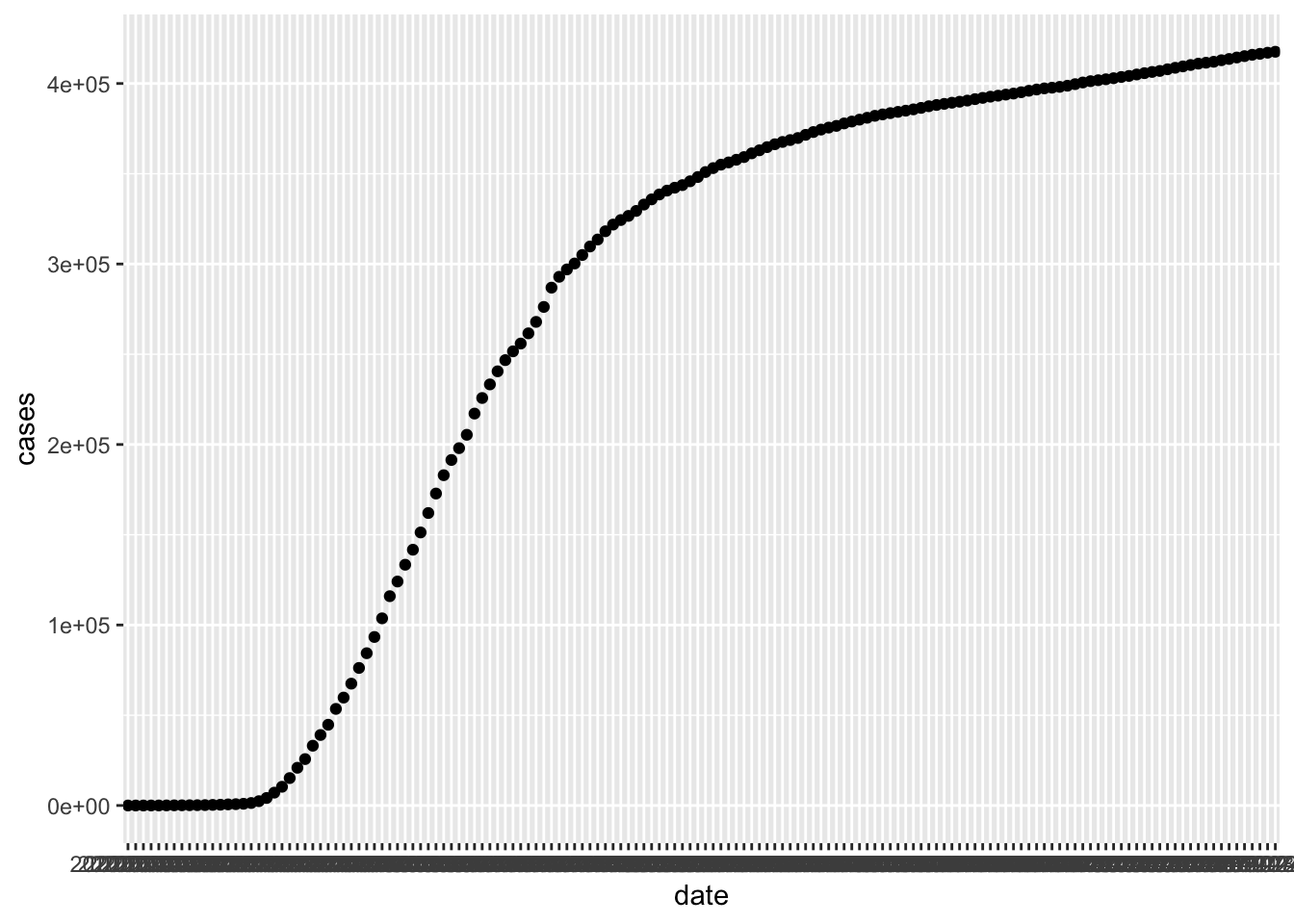
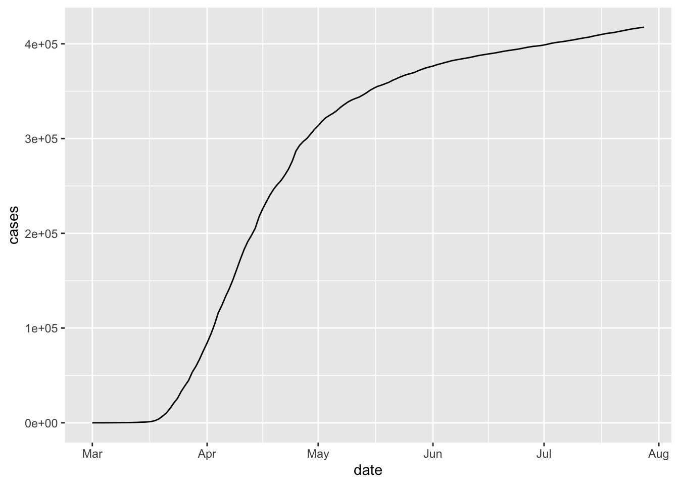
There are a couple of issues. First, the dates aren’t showing up very nicely, and second, it might be nice to have a line rather than a sequence of points. We can fix the dates by using lubridate and changing the data variable from a chr variable to a Date variable. We recommend using this format for any variable that stores a date, especially when combining with ggplot2. In order to convert a character variable into a date, you need to specify the format that the date is in from among ymd, ydm, mdy, myd, dym or dmy. If there are times involved, you add an underscore and then the correct combination of h m and s.
To get a line rather than a scatterplot, we use geom_line.
If we want to plot multiple states on the same graph, it might be easiest to use the color aesthetic. We also note here that we don’t have to save the filtered data set and use that variable in a separate ggplot call; we can simply pipe directly to ggplot.
covid <- mutate(covid, date = lubridate::ymd(date))
filter(covid, state %in% c("California", "Illinois")) %>%
  ggplot(aes(x = date, y = cases, color = state)) +
  geom_line()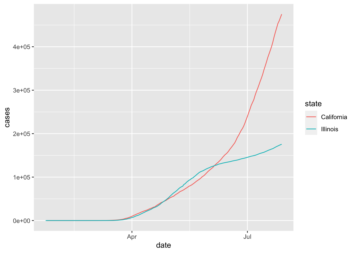
This plot is perhaps a bit hard to read because we can’t see what is happening before April. If we convert the \(y\)-axis to log scale, then it is easier to see the behavior when the number of cases is small.
filter(covid, state %in% c("California", "Illinois")) %>%
  ggplot(aes(x = date, y = cases, color = state)) +
  geom_line() +
  scale_y_log10()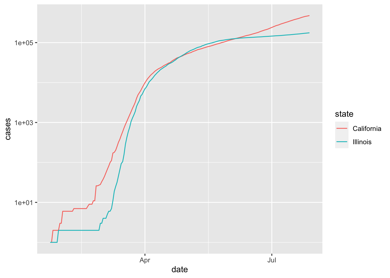
Note, however, that unless you are used to reading graphs with log scale on the \(y\) axis, the second plot can appear misleading in the sense that it is not as obvious that California is experiencing a much faster rate of increase of cases than Illinois is July, 2020. In particular, it is harder to see at a glance that California has more than twice the cumulative number of cases as Illinois does on July 29, 2020.
Next, let’s consider the daily new cases in each state. We can get the number of new cases on a given day by taking the total number of cases on the given day and subtracting the total number of cases on the previous day. The R command for doing this is diff . For example,
## [1] 3 2 -4Note that the length of the output is one less than the length of the input, so in our setting we will want to add a leading zero. Let’s see how it works.
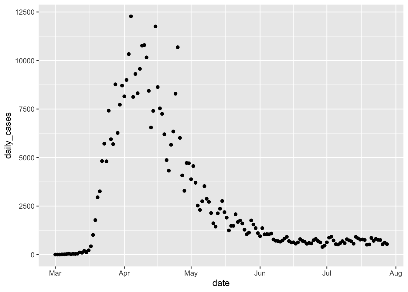
Now, we can plot the daily cases by date in New York as follows.
If we want to get a trend line, then we can add geom_smooth.
covid %>% filter(state == "New York") %>%
  ggplot(aes(x = date, y = daily_cases)) +
geom_point() +
geom_smooth()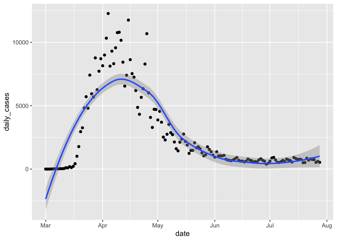
That doesn’t look very good! When fitting a curve to these points, we can adjust the amount of smoothing done via the parameter span. The default is 0.75, and smaller values correspond to less smooth functions, which will also line up more closely to the points. We can adjust the value of span until we find one that seems to pass the eyeball test. In this case, we decided to take the largest span which still matched the large number of cases near zero at the beginning of the plot. We also add a title to the plot.
covid %>% filter(state == "New York") %>%
  ggplot(aes(x = date, y = daily_cases)) +
  geom_point() +
  geom_smooth(span = .14) +
  labs(title = "Large April peak of COVID-19 cases in NY")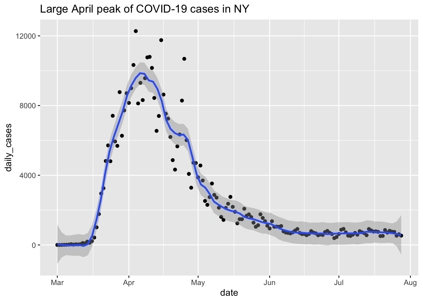
Our experience has been that many times when we want to make a plot, we can get a decent first plot with the absolute basics geom_point and/or geom_smooth together with appropriately chosen aesthetics. However, there is often some fine-tuning, either in terms of manipulating the data set or adding ggplot aspects that needs to be done in order to get a good looking plot. Each visualization seems to require its own bit of extra work, which is why there are entire books written on data visualization.
Question: why didn’t we use geom_line for the daily cases? Try it and see which plot you prefer.
6.1.2 Boxplots
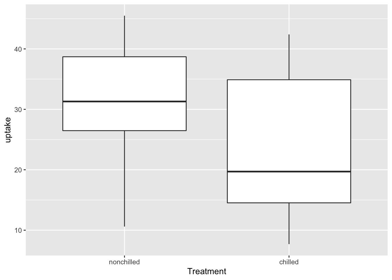
Boxplots are commonly used visualizations to get a feel for the mean and spread of a variable. Here is an example using the CO2 data.
Let’s look at a more interesting data set. Consider the bechdel data set which is in the fosdata package. This data set was used in the 538 article The Dollar-And-Cents Case Against Hollywood’s Exclusion of Women. The Bechdel test is a test for fiction that asks whether two women talk about something other than a man. You can load the data via
This data set consists of 1794 observations of variables, which include the values year that the movie was released, binary is FAIL/PASS as to whether the movie passes the Bechdel test, budget_2013, which is the budget of the movie adjusted for inflation to 2013 levels, and intgross_2013, which is the international gross of the movie adjusted for inflation to 2013 levels.
Let’s see what percentage of movies passed the Bechdel test.
##    Length     Class      Mode
##      1794 character character
In 991 out of the 1794 movies, there was no conversation between two women about something other than a man. There are several interesting things that one could do here, and some of them are explored in the exercises. For now, let’s look at the budget in 2013 dollars. Note that there is no x aesthetic in this case.
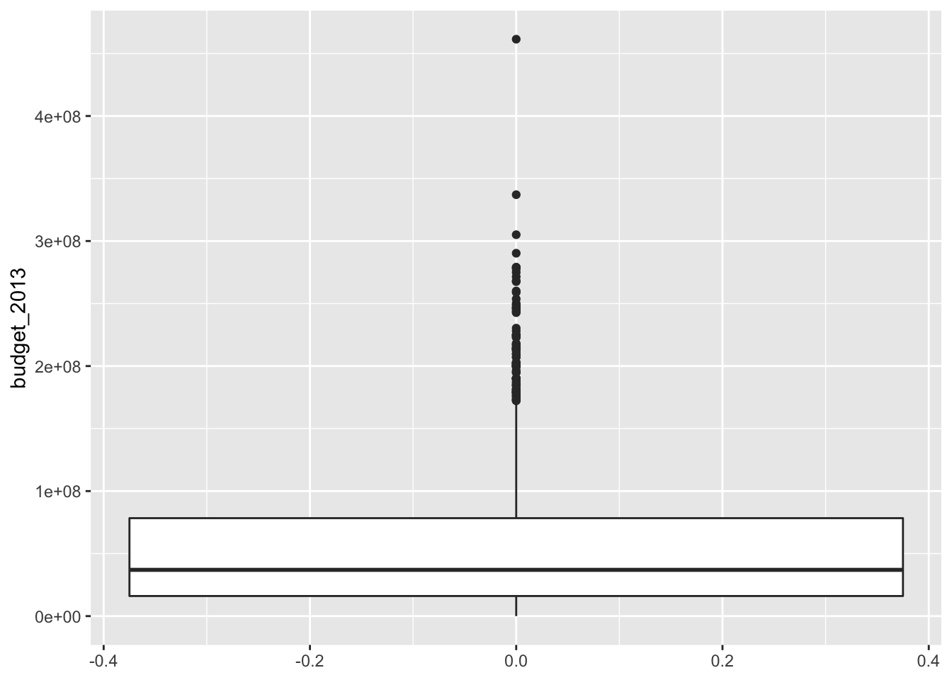
The thick line in the middle is the median of the data, and the top and bottom lines of the rectangle are the 75th and 25th percentile, respectively. The whiskers extend from the rectangle out to either 1.5 times the difference between the 75th and 25th percentiles, or out to the last point in the data, whichever is nearest. Points that fall outside of the whiskers are plotted individually.
We see that the budgets of the movies are pretty heavily right skew. Now, let’s look at the budgets of films that pass the Bechdel test versus those that do not.
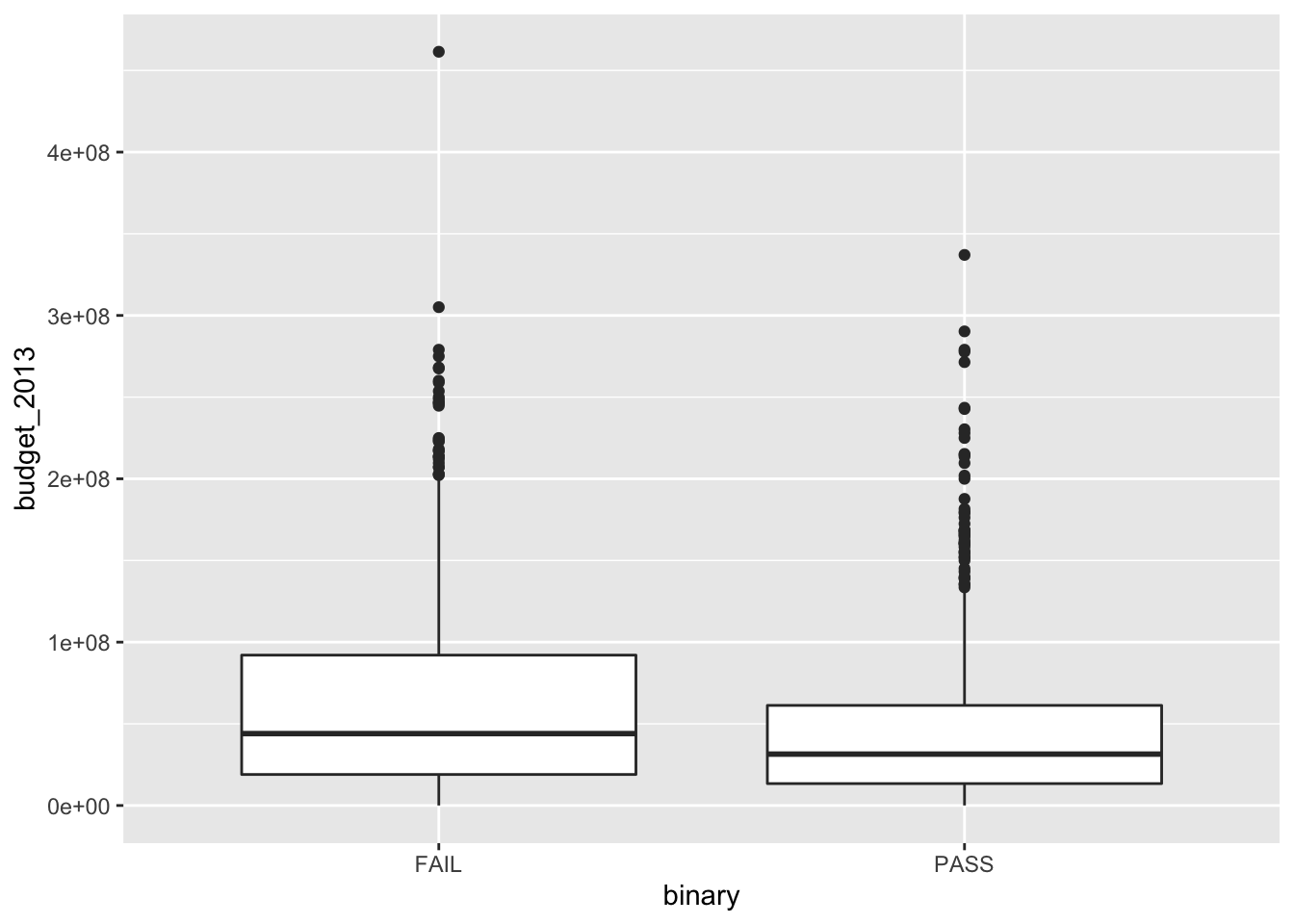
We can spruce up this plot a bit by adding notches. The notches in the boxplots correspond to an error estimate for the median. (We will learn more about this for error estimates of the mean in Chapter 7.) Since the error estimates are disjoint, that is evidence that perhaps films have different budgets depending on whether they pass the Bechdel test. We might also like to see the actual data points in addition to just the boxplot, which can hide things. When including points, we need to remove the outliers from the original plot or else they will appear twice. We also introduce geom_jitter, which jitters the point a bit around its actual location so that we can better see how many data points there are. Then, we choose alpha = 0.15, which introduces transparency of the geom. Finally, we change the labels.
ggplot(bechdel, aes(x = binary, y = budget_2013)) +
  geom_boxplot(notch = T, outlier.size = -1) +
  geom_jitter(height = 0, width = 0.2, alpha = .15) +
  labs(y = "Budget in 2013 Dollars",
       x = "Bechdel Test Result",
       title = "More high budget movies fail the Bechdel Test")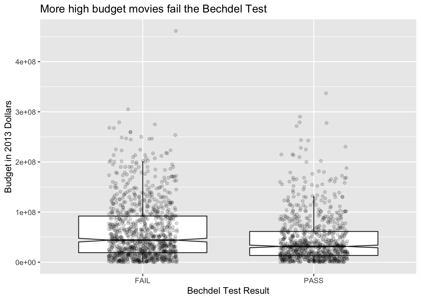
6.2 Visualizing Distributions
In Chapter 4, we saw how to estimate a density function from data and compare it to a known density function in order to decide whether data (plausibly) comes from a specified distribution. In this section, we show how to do some of those things in ggplot2, and we also introduce qq plots.
6.2.1 Histograms
Histograms are another way of seeing the distribution of a numerical variable. We saw them already when we were looking at probability density functions and using simulation to guess or verify the type of random variable that we are dealing with. In this section, we will see how they work in ggplot2.
Let’s look at the Bechdel movie set again and get a histogram of the budgets in 2013 dollars.
## `stat_bin()` using `bins = 30`. Pick better value with `binwidth`.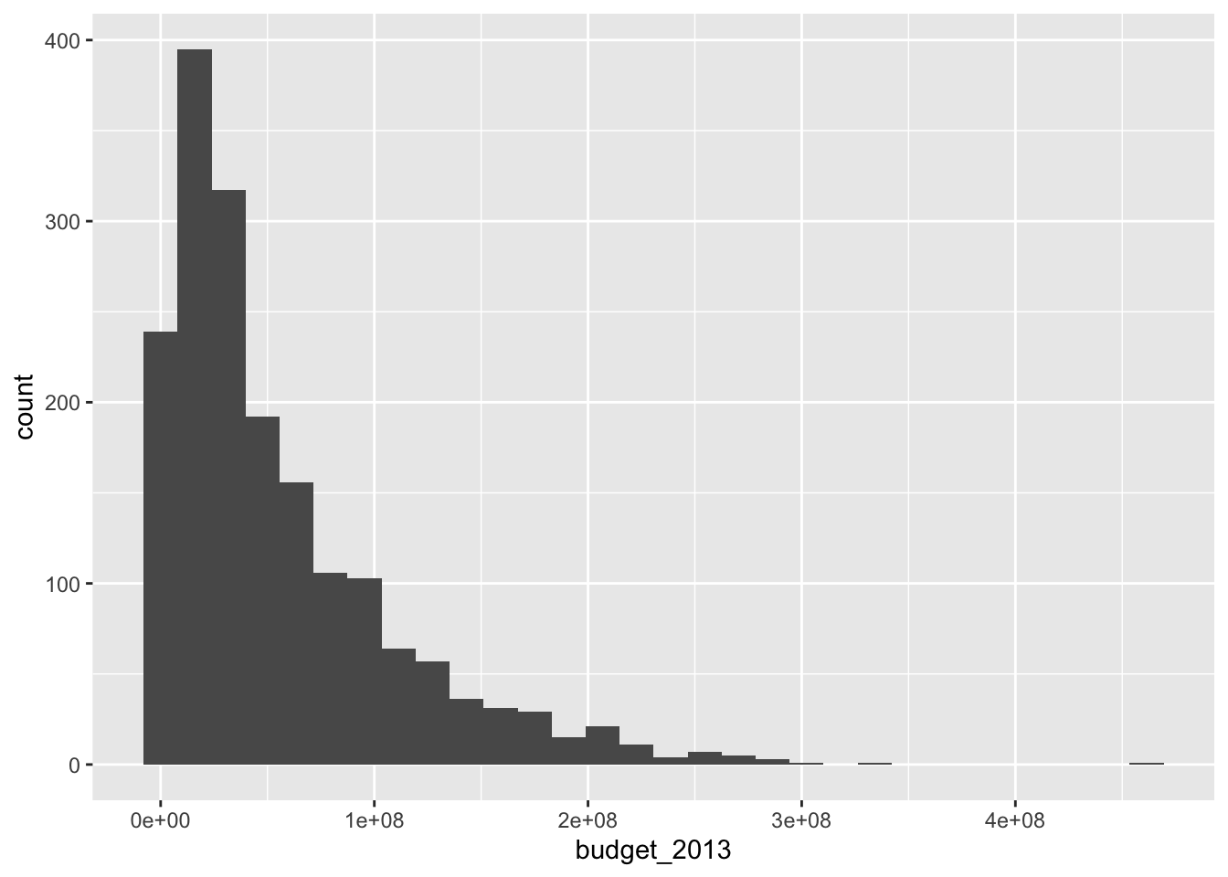
Unlike the base R function hist, geom_histogram does not try to guess an appropriate number of bins for the histogram. Instead, it always defaults to 30 and recommends that you pick a better value. Let’s examine the histogram with a couple of different number of bins. When using geom_histogram, you will usually need to play with the number of bins until you find a value that you feel faithfully represents the data.
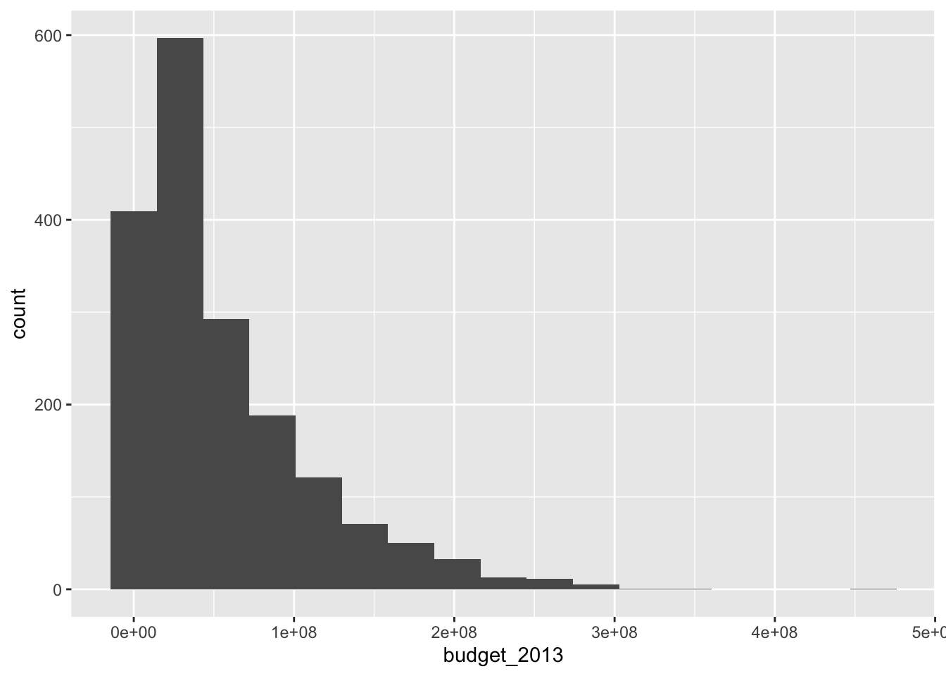
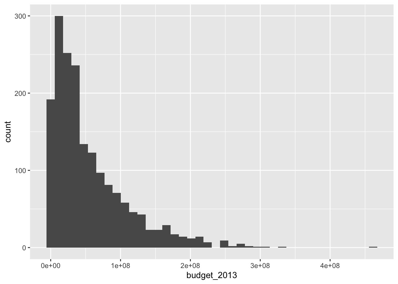
The histogram with 17 bins indicates that there are the most movies with a small, but not tiny budget. Then the number of movies in various bins decreases as the budget increases. We can also try to visualize what is happening with whether the movies pass the Bechdel test with a histogram.
ggplot(bechdel, aes(x = budget_2013)) +
  geom_histogram(aes(fill = binary), bins = 17) +
  labs(fill = "Bechdel Test")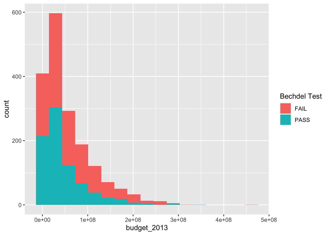
It is hard to see what is going on here. Better would be if we had each histogram plotted on its own axes. In the graphical lexicon, that is called faceting . We will use the ggplot2 function facet_wrap to do this:
ggplot(bechdel, aes(x = budget_2013)) +
  geom_histogram(aes(fill = binary), bins = 15) +
  facet_wrap(~binary) +
labs(fill = "Bechdel Test") 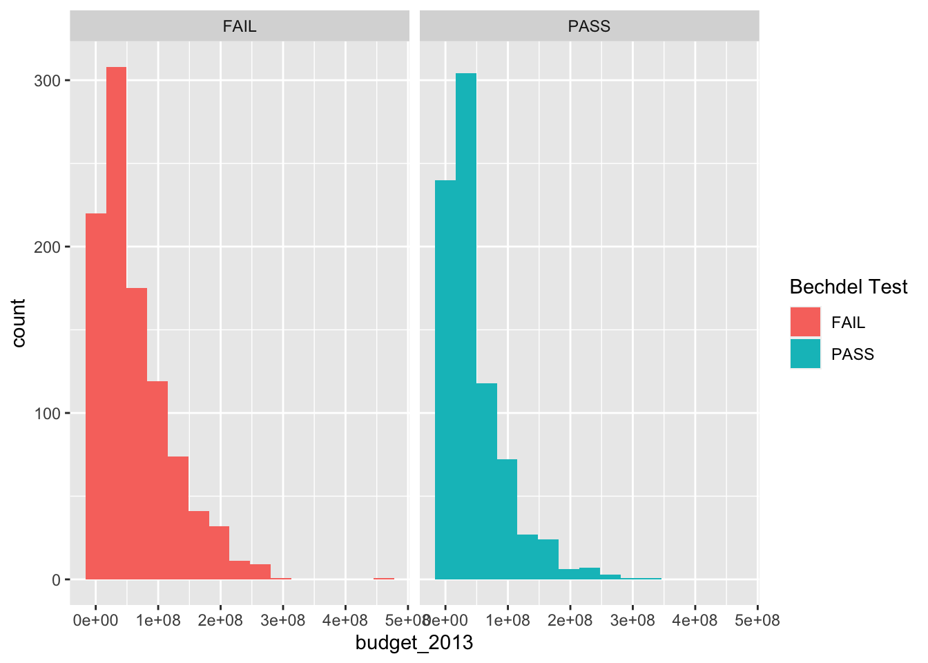
We can see that there are more movies that pass the Bechdel test in the lowest bin, and more movies that fail it in the higher bins. Now, though, the colors don’t mean anything, so we would probably be better off removing the color. Another thing that is often very useful is to be able to rotate the labels on the \(x\)-axis. The command is theme(axis.text.x = element_text(angle=90, vjust=0.5)).
ggplot(bechdel, aes(x = budget_2013)) +
  geom_histogram(bins = 15) +
  facet_wrap(~binary) +
  theme(axis.text.x = element_text(angle=90, vjust=0.5)) +
  labs(title = "Movies Passing Bechdel test have lower budgets",
       x = "Budget in 2013 dollars")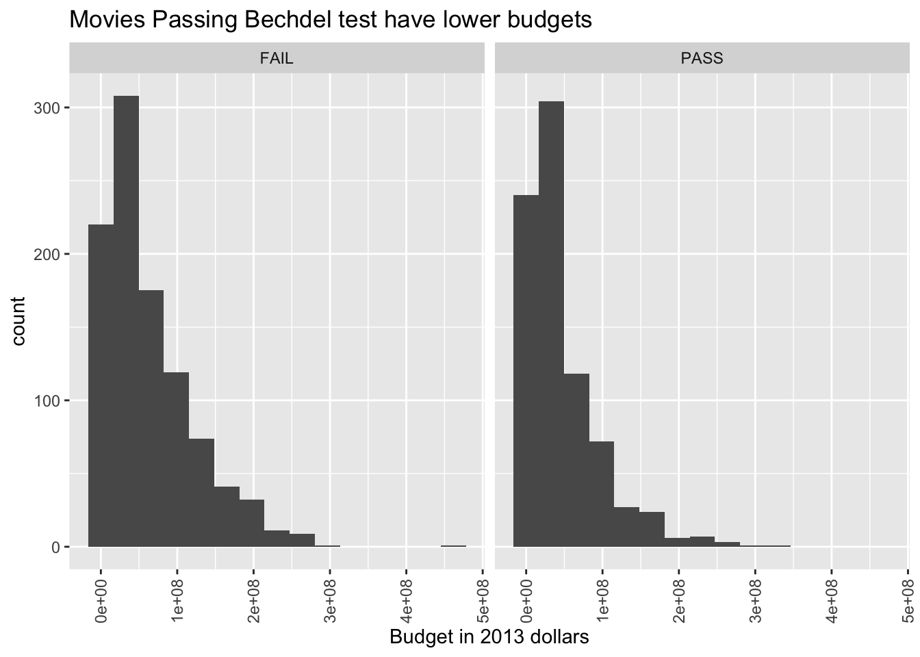
6.2.2 QQ plots
One way to compare a sample with a known distribution is by using qq plots. Unlike density estimation, qq plots do not have any extra parameters that need to be selected, and qq plots can be easier to interpret.
What is a qq plot? Well, suppose you have a random sample of size \(N\) from an unknown distribution, and you want to create a qq plot to compare this to a uniform distribution on the interval \([0,1]\). You would order the data points from smallest to largest, which we denote by \(X_{(1)}, \ldots, X_{(N)}\). Then, you would compare the ordered data points to the expected value of the ordered data points, which in this case turns out to be \(1/(N+1), \ldots, N/(N+1)\) (trust me on this, or look ahead to Section @ref(order_statistics)). One way to compare would be to plot the ordered pairs \[ (X_{(1)}, \frac 1{N+1}), \ldots, (X_{(n)}, \frac {N}{N+1}) \] Such a plot is called a qq plot. If the sample comes from a uniform \([0,1]\) random variable, then we would expect the ordered pairs to roughly fall on a straight line. Otherwise, we would not expect the ordered pairs to fall on a straight line with slope 1. The algorithm that R uses is a bit more complicated than the above, but it is mostly only noticeable when the data set is small.
Let’s look at an example. Here, we take a random sample from a normal distribution with mean 0 and standard deviation 1, and create a qq plot to compare it to a normal(0, 1) random variable. The result should be approximately a straight line.
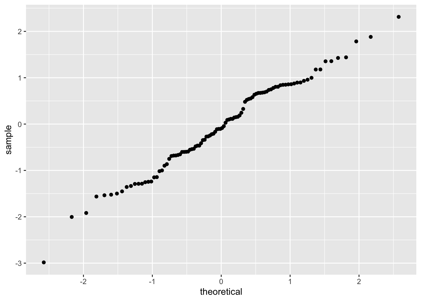
Note that the data very approximately follows a straight line with slope 1. Now, let’s see what happens when our data comes from a heavy-tailed distribution such as t:
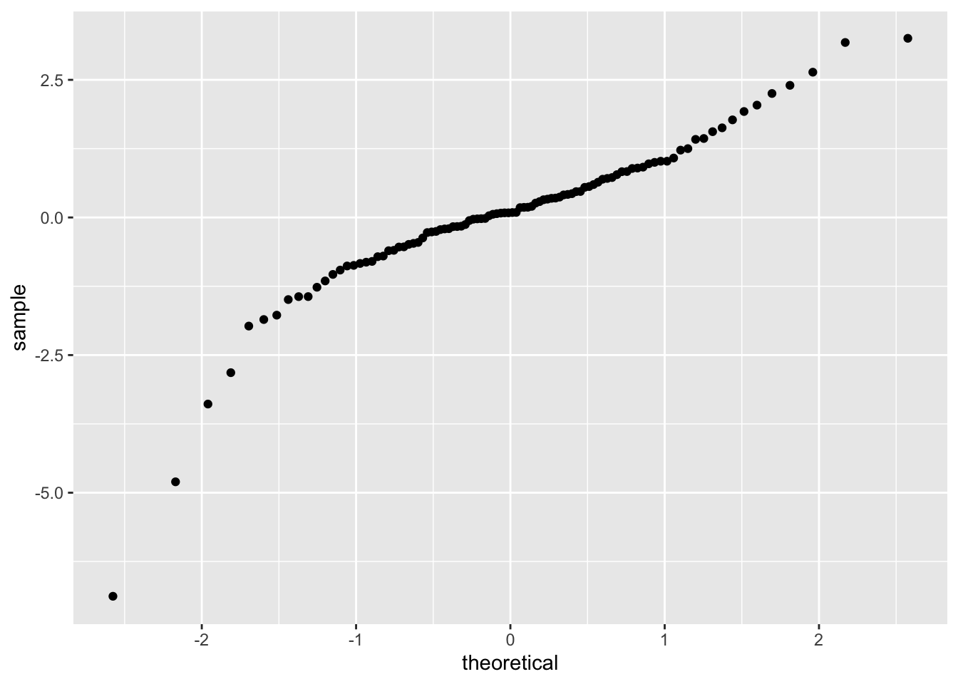
Note that the qq plot now has an S shape. Light tailed distributions also have an S shape when compared to normal, but the S goes the other way.

Finally, skewed data tends to have a U shape when compared to normal:
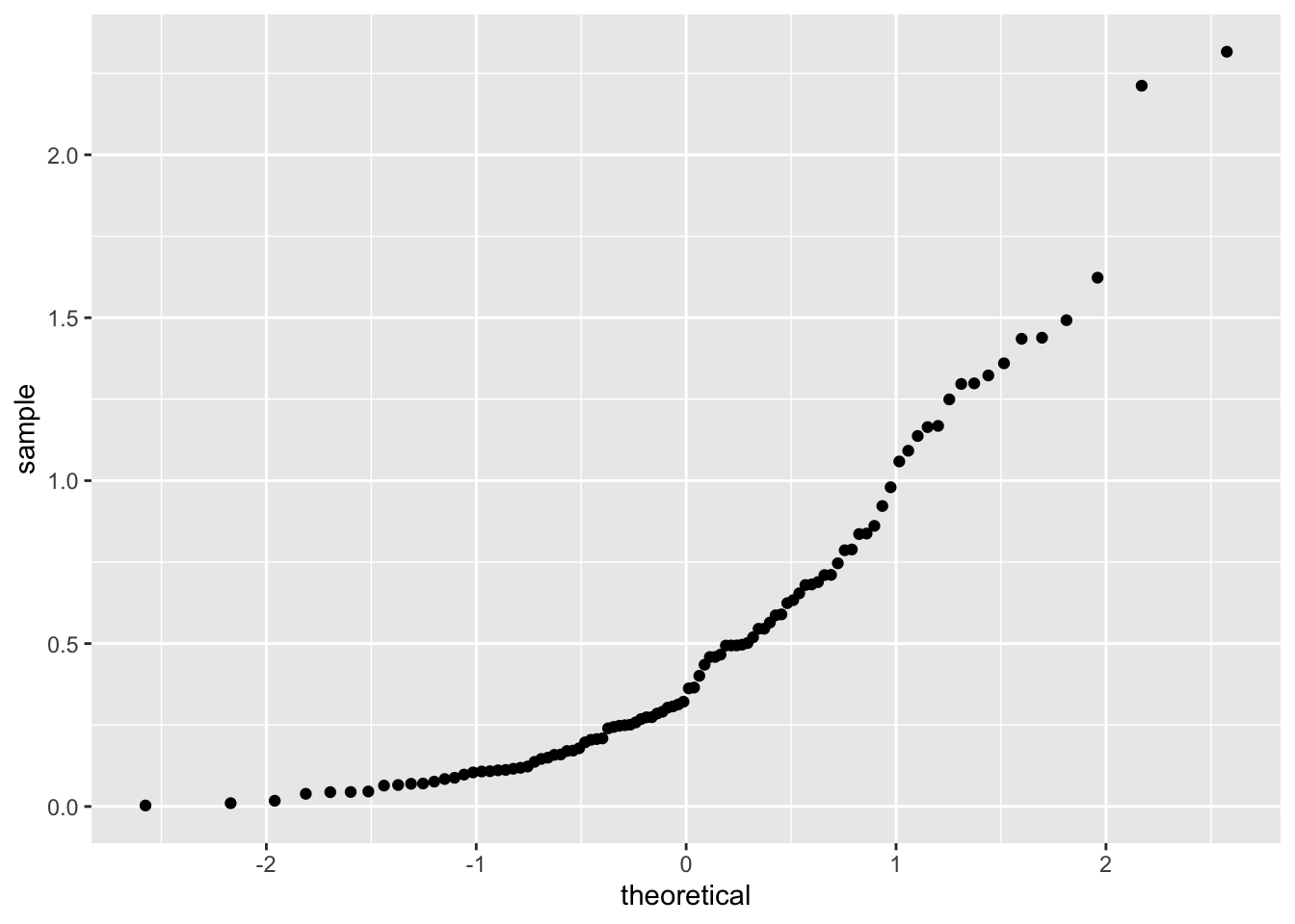
It is possible to compare our data to other distributions, as well as to compare two samples, but we will leave that for another class. We will need to interpret qq plots again in Chapter 10 in the context of simple linear models.
Now, we show how to do a normal qq plot by hand. Suppose we have 5 points, and we wish to make a qq plot versus a standard normal random variable. The key step is finding the expected value of the minimum, second largest, and so on. To do this, we will make a matrix that has 5 columns and 10,000 rows worth of random observations of a normal rv. We will sort each row, and then take the mean of each column (or we could use replicate). The values we obtain are estimates for the expected value of the order statistics.
norm_mat <- matrix(rnorm(50000), nrow = 10000)
norm_mat <- apply(norm_mat, 1, sort)
expected_values <- apply(norm_mat, 1, mean)
Now, let’s get some data:
## [1] -1.2070657 0.2774292 1.0844412 -2.3456977 0.4291247sort it and put it inside a data frame, then plot it:
plot_dat <- data.frame(x = expected_values, y = sort(my_dat))
ggplot(plot_dat) +
  geom_point(mapping = aes(x = x, y = y, color = "hand")) +
  stat_qq(mapping = aes(sample = y, color = "statqq"))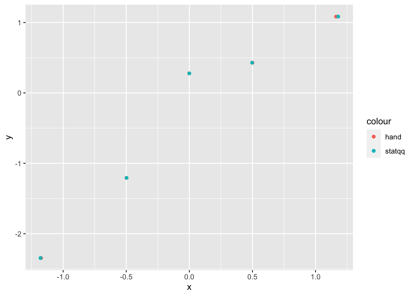
As you can see, our results by hand are very close to the results that stat_qq gives, but not exact. The reason for this is twofold: first, we have estimated the expected values of the order statistics, which will introduce some error. Second, stat_qq uses a modified version of the above algorithm that tends to give very similar, but slightly different results. For details, see the documentation of qqplot in base R, which stat_qq is modeled off of.
6.2.3 Plotting pmfs
In this section, we illustrate the use of dplyr tools and geom_bar to plot pmf’s. There are two possibilities. In the first, you wish to store the tabulated data in a data frame and plot it. The verb count is the dplyr tool that most closely mimics the base function table. We illustrate its usage here:
##    x  n
## 1 11  3
## 2 12  4
## 3 13  1
## 4 14  7
## 5 15  9
## 6 16 12
Note that we really would prefer the proportion of values rather than the raw count in poisTable. So, we need to mutate the data frame:
##    x  n  prop
## 1 11  3 0.015
## 2 12  4 0.020
## 3 13  1 0.005
## 4 14  7 0.035
## 5 15  9 0.045
## 6 16 12 0.060
Now, it is a simple matter to call ggplot, using the geom geom_bar:

The second way is easier, but requires usage of the mystical ..count.. argument. It assumes that you have the un-tabulated data. In this case, you simply use geom_bar with only one aesthetic.
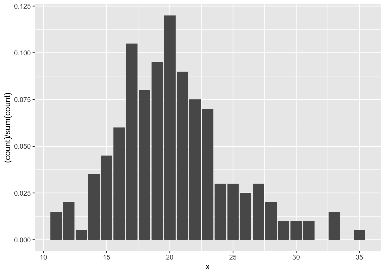
Let’s clean up that \(y\)-axis label:

This technique seems more difficult than using the base R functions, which is why we did not introduce ggplot2 at the beginning of the book. Our advice when deciding whether to use base R plotting functions or ggplot2 plotting functions is to use the tool that is easiest for you to get a plot that is the quality that you need for your purposes.
6.2.4 Plotting functions
Sometimes, you would like to plot the graph of a function, like \(y = x^2\). While ggplot2 might not be the most convenient tool for doing that, it is easy to do that if you want to plot functions on top of a scatterplot. Let’s look at an example.
Suppose you are given data that more or less lies along the curve \(y = x^2 + x + 1\), and you wish to plot the data and the curve \(y = x^2 + x + 1\) on the same plot. The easiest way to do so is with the stat_function function.
quadData <- data.frame(x = runif(20,0,10))
quadData <- mutate(quadData, y = x^2 + x + 1 + rnorm(20,0,10))
Let’s plot the data:
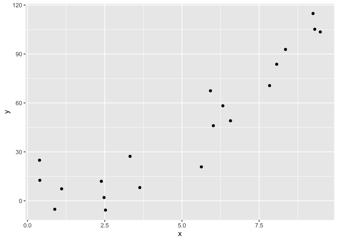
And here is how you use geom_function. Note that geom_function is really nice for plotting functions, but it can sometimes be challenging to get correct colors and labeling if you are plotting multiple functions on the same graph. An alternate approach is to define a new data frame containing \(x\) and \(y\) coordinates for the function you wish to plot, then use geom_line to draw the curve.
f <- function(x) x^2 + x + 1
ggplot(quadData, aes(x,y)) +
  geom_point() +
  geom_function(fun = f, color = "red")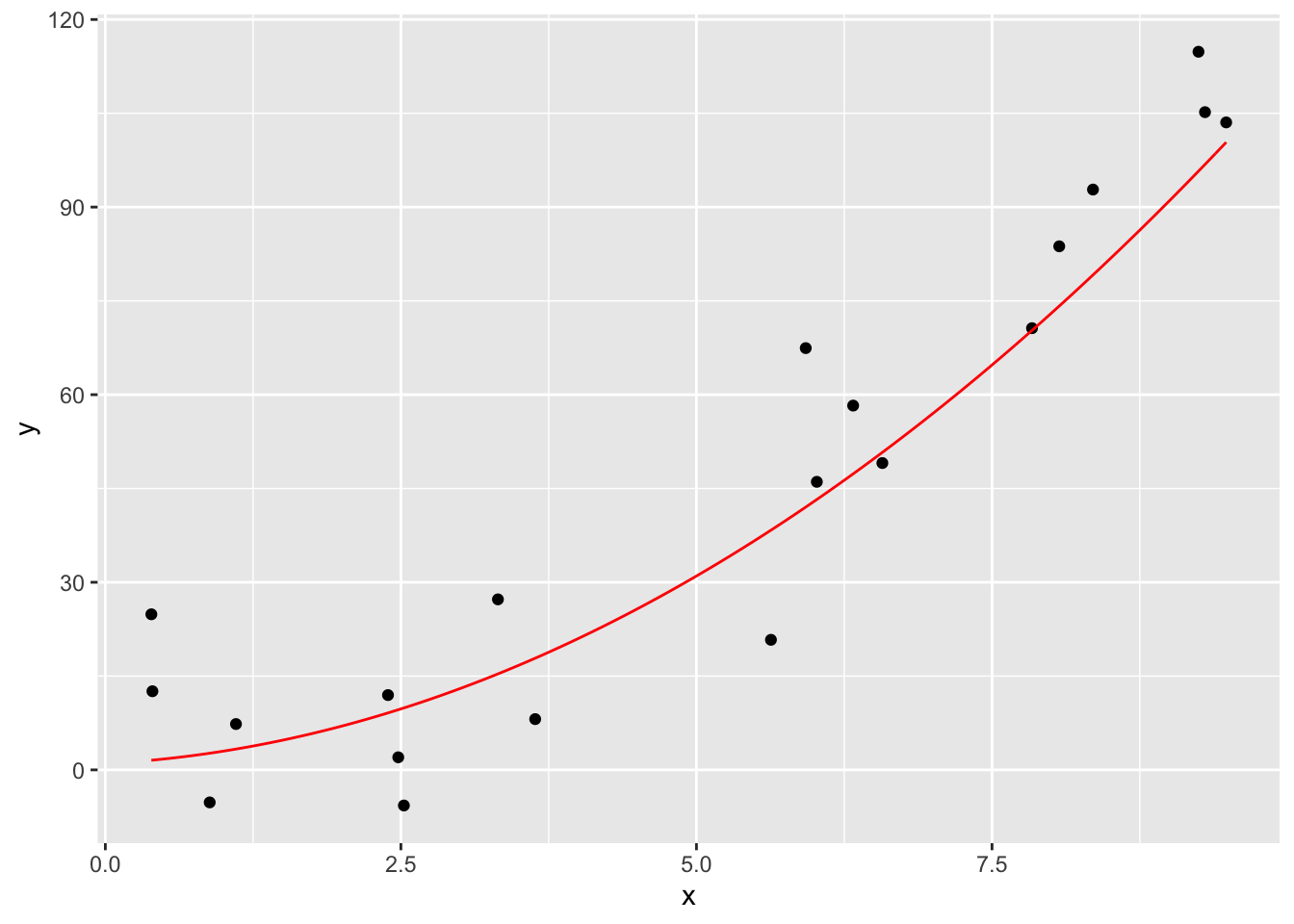
We can also use geom_function to overlay a pdf on top of a density estimate based on data as follows.
norm_data <- data.frame(x = rnorm(10000, 0, 2))
f <- function(x) dnorm(x, 0, 2)
ggplot(norm_data, aes(x = x)) +
  geom_density() +
  geom_function(fun = f, color = "red")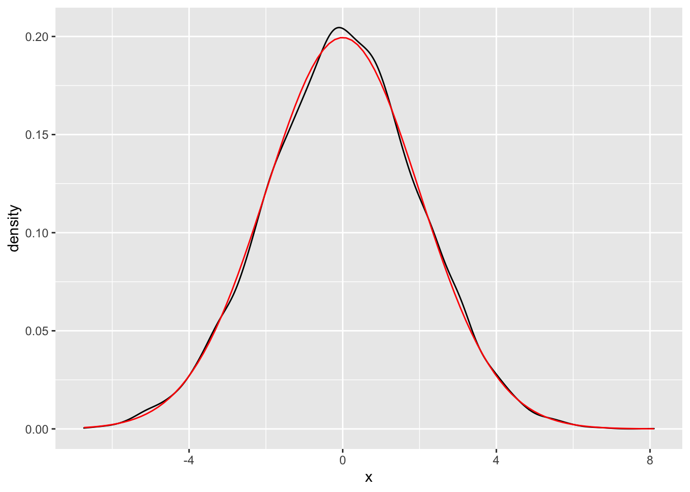
6.3 Long Data
Data for ggplot must be stored as a data frame (or equivalent structure, such as a tibble), and usually needs to be tidy.
anorexia data in the MASS package.
Create a side-by-side boxplot of the Pre- and Post-treatment weights of the patients in the CBT group.
Let’s look at the data.
##   Treat Prewt Postwt
## 1  Cont  80.7   80.2
## 2  Cont  89.4   80.1
## 3  Cont  91.8   86.4
## 4  Cont  74.0   86.3
## 5  Cont  78.1   76.1
## 6  Cont  88.3   78.1
Note the use of MASS::anorexia to pull out the data set from the package, since we don’t want the entire MASS package loaded into our R session.
The plot we want needs to be able to specify Pre- and Post- values as an aesthetic, and aesthetics are assigned to variables. However, the Pre/Post information is not stored in a variable. Instead, is stored in the column names.
There should be a variable called Phase that describes which phase of the experiment when the weight was measured.
We can pivot the information from the column names into the desired Phase variable using pivot_longer:
library(tidyr)
anorexia_long <- pivot_longer(anorexia, cols = -Treat, names_to = "Phase", values_to = "Weight")
head(anorexia_long)
## # A tibble: 6 x 3
## Treat Phase Weight
## <fct> <chr> <dbl>
## 1 Cont Prewt 80.7
## 2 Cont Postwt 80.2
## 3 Cont Prewt 89.4
## 4 Cont Postwt 80.1
## 5 Cont Prewt 91.8
## 6 Cont Postwt 86.4Now, the values Prewt and Postwt are values of a variable, and can be assigned to the x aesthetic.
We send the data to ggplot after filtering just the CBT treatments.
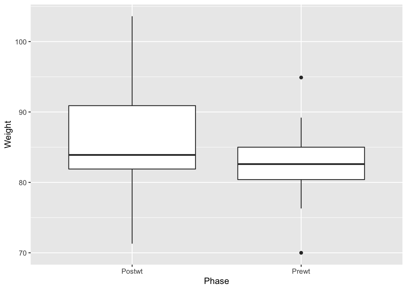
Observe that the phases of the experiment are backwards (read left to right). The Prewt measurement actually came first, followed by the Postwt measurement. The plot put the two values Postwt/Prewt in alphabetical order. The issue is with the underlying nature of the data, not with the plot itself, and the fix is to correctly specify the order as a feature of the data itself.
The Phase variable is currently a character type, when it should be a factor.
The factor function in base R can convert Phase to a factor, and along the way set the order of the levels:
The Phase variable now has the correct structure
## Factor w/ 2 levels "Prewt","Postwt": 1 2 1 2 1 2 1 2 1 2 ...and so the plot shows the phases in the correct order:
anorexia_long %>%
  filter(Treat == "CBT") %>%
  ggplot(aes(x = Phase, y = Weight)) +
  geom_boxplot(outlier.size = -1) +
  geom_jitter(height = 0, width = .2, alpha = .4) +
  labs(title = "Posttreatment weight higher than pretreatment weight")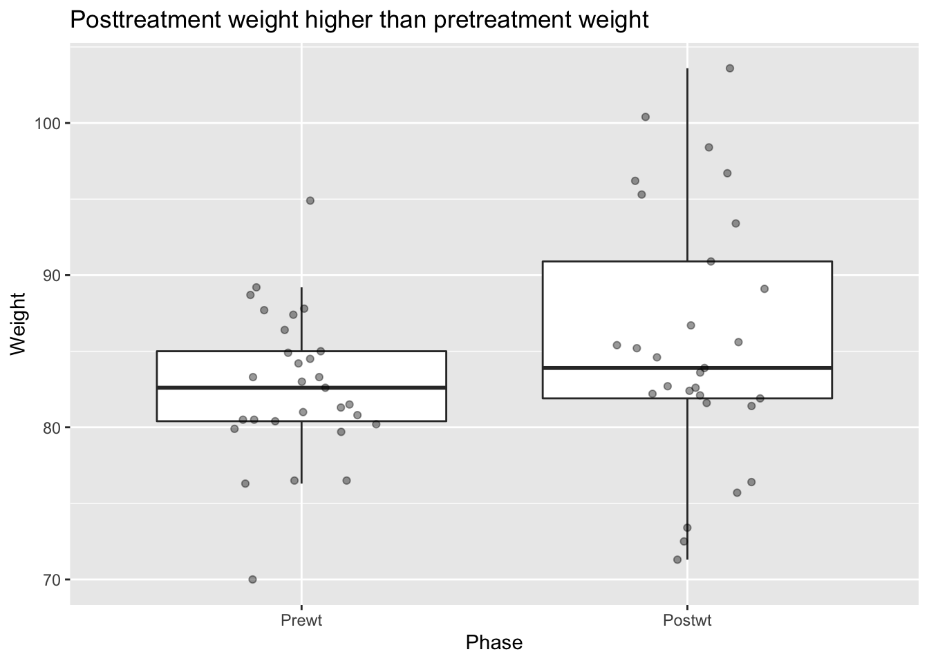
Perhaps the subjects of this experiment gained weight when treated with CBT.
This plot, however, is somewhat misleading because the relationship between the pre and post treatment scores is ignored. Namely, we aren’t indicating that each pre weight corresponds to a post weight. One way to visualize this is via a scatterplot:
filter(anorexia, Treat == "CBT") %>%
  ggplot(aes(x = Prewt, y = Postwt)) +
  geom_point() +
  stat_function(fun = function(x) x) +
  labs(x = "Pretreatment weight",
       y = "Posttreatment weight",
       title = "CBT Treatment may be effective")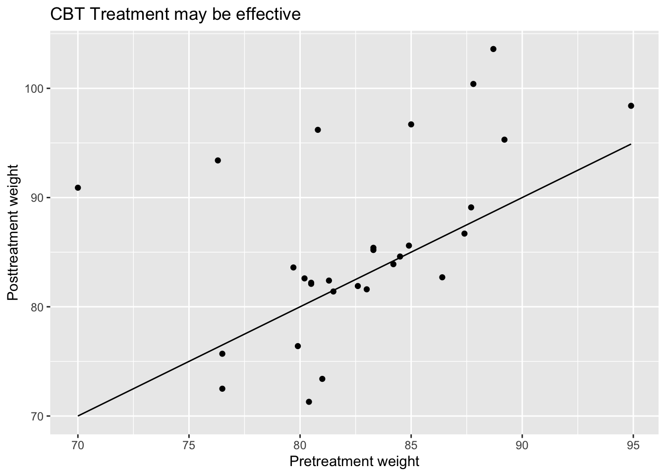
Points that lie above the line \(y = x\) correspond to patients who gained weight after the treatment, while points that are below the line \(y = x\) correspond to patients who last weight after the treatment. Based on this plot, we can see that there is a group of patients that responded well to the treatment and gained a lot of weight, while there is another group that seems symmetrically distributed about their pre-weights.
Vignette: Choropleth Maps
There are many ways of visualizing data. One very useful way of visualizing is via choropleth maps. A choropleth map is a type of map where regions on the map are shaded according to some variable that has been observed that is related to that region. One of the most common choropleth maps in the US is the national election map, colored by state. Other examples include weather maps and radar images.
These types of maps can seem intimidating to create. However, R has tools to make basic choropleth maps of the US colored along counties or states easier than it would otherwise be. The hardest part, as usual, is getting the data in the format that is required by the mapping tools.
Let’s look at the 2012 US presidential election results in Alabama, and visualize them. We start by loading the data, and computing the percentage of people who voted for Romney from among those that voted either for Romney or Obama.
pres_election <- fosdata::pres_election
pres_election <- filter(pres_election, year == 2012, stringr::str_detect(candidate, "Obama|Romney"))
pres_election <- pres_election %>%
  filter(state == "Alabama") %>%
  arrange(state, county, party) %>%
  group_by(FIPS, state, county) %>%
  summarize(percent_romney = last(candidatevotes)/sum(candidatevotes, na.rm = T)) %>%
  ungroup()
## `summarise()` regrouping output by 'FIPS', 'state' (override with `.groups` argument)## # A tibble: 6 x 4
## FIPS state county percent_romney
## <int> <I<chr>> <I<chr>> <dbl>
## 1 1001 Alabama Autauga 0.732
## 2 1003 Alabama Baldwin 0.782
## 3 1005 Alabama Barbour 0.484
## 4 1007 Alabama Bibb 0.736
## 5 1009 Alabama Blount 0.875
## 6 1011 Alabama Bullock 0.236To plot this, we need the map data.
library(maps)
alabama_counties <- map_data("county") %>%
  filter(region == "alabama")
head(alabama_counties)
## long lat group order region subregion
## 1 -86.50517 32.34920 1 1 alabama autauga
## 2 -86.53382 32.35493 1 2 alabama autauga
## 3 -86.54527 32.36639 1 3 alabama autauga
## 4 -86.55673 32.37785 1 4 alabama autauga
## 5 -86.57966 32.38357 1 5 alabama autauga
## 6 -86.59111 32.37785 1 6 alabama autaugaNotice that the counties in this data set aren’t capitalized, while in our other data set, they are. There are likely other differences in county names, so we really need to get this map data in terms of FIPS. The map data needs to contain three variables, and their names are important. It will have a variable called id that matches to the id variable from the fill data, a variable x for longitude and y for latitude.
fips_data <- maps::county.fips
fips_data <- filter(fips_data, stringr::str_detect(polyname, "alabama")) %>%
  mutate(county = stringr::str_remove(polyname, "alabama,"))
alabama_counties <- left_join(alabama_counties, fips_data, by = c("subregion" = "county"))
alabama_counties <- rename(alabama_counties, FIPS = fips, x = long, y = lat)
alabama_counties <- select(alabama_counties, FIPS, x, y) %>%
  rename(id = FIPS)
And this is how we want the data. We want the value that we are plotting percent_romney repeated multiple times with long and lat coordinates. The rest is easy.
ggplot(pres_election, aes(fill = percent_romney)) +
  geom_map(mapping = aes(map_id = FIPS), map = data.frame(alabama_counties)) +
  expand_limits(alabama_counties) +
  coord_map() +
  scale_fill_gradient2(low = "blue",mid = "white", high = "red", midpoint = .50)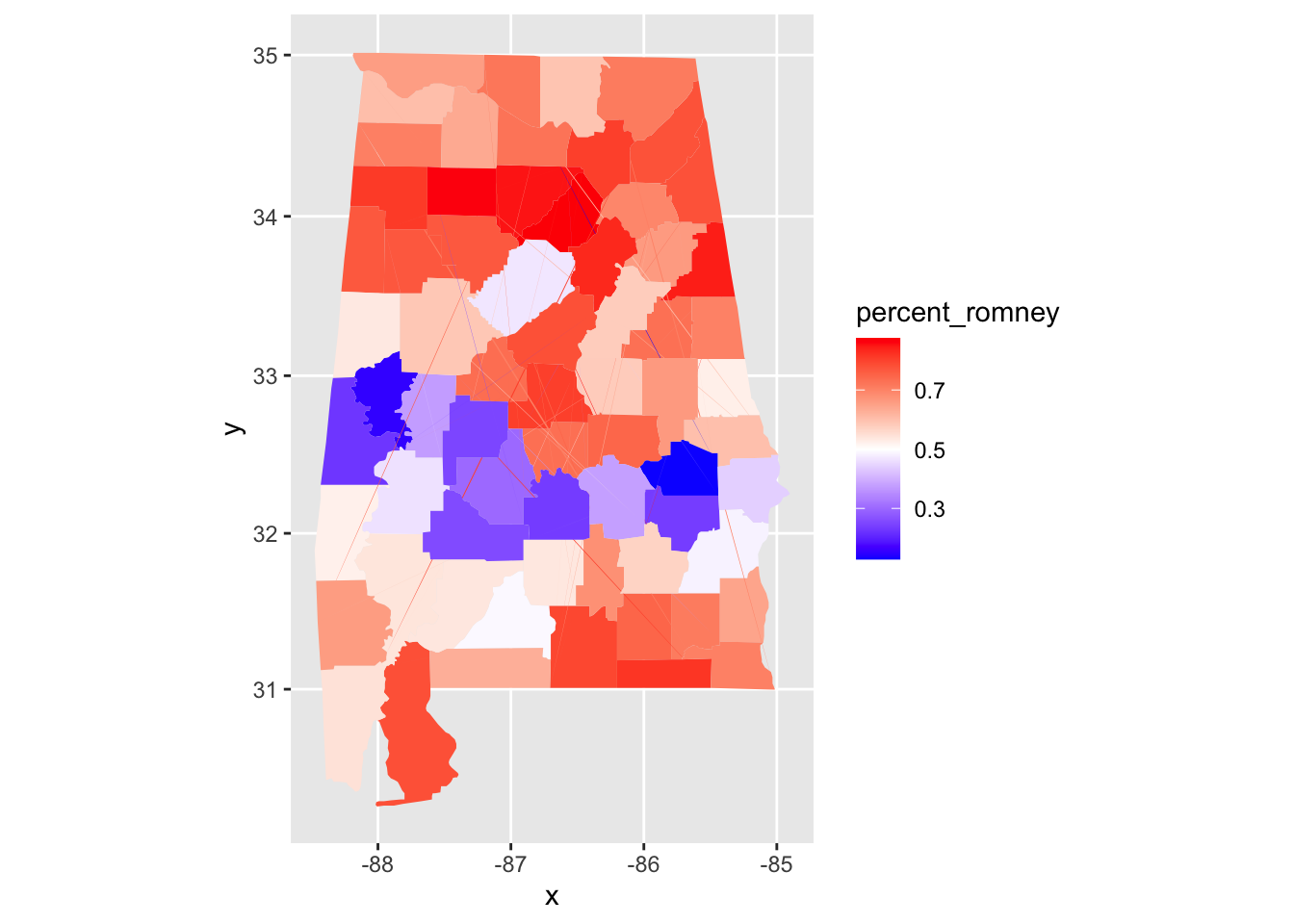
We can see that Alabama has a belt across its middle that voted in favor of Obama, while the rest of the state voted for Romney.
Exercises
-
The built-in R data set
quakesgives the locations of earthquakes off of Fiji in the 1960’s. Create a plot of the locations of these earthquakes, showing depth with color and magnitude with size. -
Create a graphic that displays the differences in mpg between 4,6, and 8 cylinder cars in the built-in data set
mtcars. -
Consider the
juuldata set in theISwRpackage. This data set is 1339 observations of, among other things, theigf1(insulin-like growth factor) levels in micrograms/liter, theagein years, and thetannerpuberty level of participants.- Create a scatterplot of
igf1level versusage. - Add coloring based on
tanner. - Is
geom_smooth,geom_lineor neither appropriate here?
- Create a scatterplot of
-
Consider the
combined_datadata set that was created in Section 5.6.2. For the 2000 election, create a scatterplot of the percent of votes cast in a county for George W. Bush versus the unemployment rate in that county. -
Consider the
bechdel_moviesdata set that was introduced in the chapter.- Create a scatterplot of the percentage of movies that pass the Bechdel test in a given year versus the year that the movie was released.
- The cost to earnings ratio is the earnings divided by the budget. Create boxplots of the cost to earnings ratio (in 2013 dollars) of movies made in 2000 or later, split by whether they pass the Bechdel test.
Exercises 6 - 8 all use the
Battingdata set from theLahmanpackage This gives the batting statistics of every player who has played baseball from 1871 through the present day. -
- Create a scatterplot of the number of doubles hit in each year of baseball history.
- Create a scatterplot of the number of doubles hit in each year, in each league. Show only the leagues ‘NL’ and ‘AL’, and color the NL blue and the AL red.
-
Create boxplots for total runs scored per year in the AL and the NL from 1969 to the present.
-
- Create a histogram of lifetime batting averages (H/AB) for all players who have at least 1000 career AB’s.
- In your histogram from (d), color the NL blue and the AL red. (If a player played in both the AL and NL, count their batting average in each league if they had more than 1000 AB’s in that league.)
-
Use the
Peopledata set from theLahmanlibrary.- Create a barplot of the birth months of all players. (Hint:
geom_bar()) - Create a barplot of the birth months of the players born in the USA after 1970.
Exercises 10 - 14 use the
babynamesdata set from thebabynamespackage, which you probably need to install. - Create a barplot of the birth months of all players. (Hint:
-
Make a line graph showing the total number of babies of each sex, plotted over time.
-
Make a line graph showing the number of different names used for each sex, plotted over time.
-
Make a line graph showing how many babies of your gender have your name, plotted over time. If your name doesn’t appear in the data, use the female name “Alexa”.
-
Make a line graph comparing the number of boys named Bryan and the number of boys named Brian from 1920 to the present.
-
I wish that I had Jessie’s girl, or maybe Jessie’s guy? One one graph, plot the number of male and female babies named Jessie over time.
Three time periods show up in the history of Jessie:
- More male than female Jessie
- More female than male Jessie
- About the same male and female Jessie.
Approximately what range of years does each time period span?
-
Data scientist Kieran Healy created this widely circulated figure:
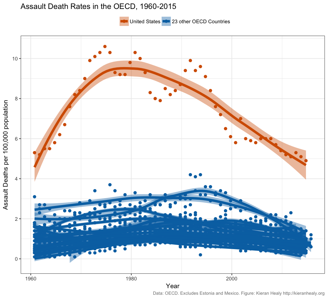 Recreate this plot as well as you can, using Healy’s github data.
Read Healy’s blog post and his
follow up post.
Do you think this figure is a reasonable representation of gun violence in the United States?