Chapter 3 Evaluating Models
We will follow the book pretty closely for parts of this chapter. I like how they discuss the ethical aspects of modeling; a topic that is more often than not overlooked.
3.0.1 Is the model fair
The authors suggest asking yourself several questions about your model as a check on whether it is fair.
- How was the data collected?
- By whom and for what purposes was the data collected?
- How might the results of the analysis, or the data collection itself, impact society?
- What biases might be baked into the analyses?
Let’s answer these questions for the data set that we analyzed in the previous chapter.
- How was the data collected?
From the authors: “The study was conducted in 297 eyes of 297 healthy subjects aged 18 to 87 years. In one randomly selected eye of each participant the volume and mean thicknesses of the different macular layers were measured by SD-OCT using the instrument’s macular segmentation software.” One positive note is that the study protocol was approved by the IRB of Hospital Clinico San Carlos, Madrid Span. This gives some reassurances that the data was collected in a fair way that did not harm the subjects. It also followed the Helsinki declaration guidelines, which I had never heard of before. All patients signed an informed consent form after the study protocol and its purpose was expained in detail. It seems that the authors were trying there best to collect the data in an ethical manner.
The authors also write “The main limitations of our study were that participants were all European descent such that data collected may not be translatable to other ethnicities. Also its cross-sectional nature means that the significant changes with age detected require longitudinal studies to properly calculate the rate of thinning/thickening of the different retinal layers with age.” The authors recognize that the data collected has biases, and warn against using it incorrectly.
- By whom and for what purposes was the data collected?
This one is pretty straight-forward. It was collected by the authors of the study for the purposes of determining the effect of age on retinal thickness. The authors make a case in their paper that this is an important topic for the treatment and diagnosis of severe eye diseases. Again, this seems ethical.
- How might the results of the analysis, or the data collection itself, impact society?
I can imagine some negative impacts on society, but some seem pretty far fetched. The most plausible negative impact to me would be if people misinterpret the study and apply it to ethinc groups that weren’t represented in the study. A more far-fetched impact could be an increase in ageism or sexism, since the study confirms differences in retinal thickness due to age and sex. However, since retinal thickness is not necessarily known as a desirable or undesirable trait, this seems unlikely.
- What biases might be baked into the analyses?
The authors do a good job of explaining two: lack of ethnic diversity and lack of longitudinal study. It might be better to study the same patients over time to see whether retinal thickness of individuals changes over time, rather than being associated with age.
Overall, the authors did a good job of explaining limitations and warning against using the data inappropriately.
The textbook gives examples of models that are more problematic:
According to this article, Amazon developed a model to rate resumes for jobs. The model was trained on resumes sent to the company over a 10-year period, and reportedly downgraded resumes that included the word “women’s” as in “women’s chess club captain” and graduates of two all-women’s colleges. Those items were removed, but there was little guarantee that the model was not still biased against women in ways that were harder to see. The model was removed from use.
There is serious doubt about the accuracy of facial recognition models. According to this New York Times article from 2019, researchers from MIT found that Amazon’s (I’m not trying to pick on Amazon, other companies do this as well) facial recognition software made no errors in recognizing the gender of lighter-skinned men. It misclassified women as men 19 percent of the time, and mistook darker-skinned women for men 31 percent of the time. The model has improved, but one wonders about the fairness of a model that doesn’t perform as well on some groups as on others.
3.1 How wrong is the model?
George Box famously said: “All models are wrong, but some are useful.” How do we attempt to see whether our model is useful?
3.1.1 Check the assumptions
One thing that is important to do is to check the assumptions of your model. To do that, you have to really know what the model is! If we return to ONL as described by age, we have the following linear regression model:
\[ Y_i = \beta_0 + \beta_1 x_i + \epsilon_i \]
where \(\epsilon_i\) are independent, identically distributed normal random variables with mean 0. All of our assumptions are implicit in the model formulation.
- Conditioned on the value of \(x_i\), the outcome of \(Y_i\) is independent of the observed data on any other case \(j\).
- The typical \(Y\) outcome can be written as a linear function of \(x\), \(\mu = \beta_0 + \beta_1 x\).
- At any \(x\) value, \(Y\) varies normally around \(\mu = \beta_0 + \beta_1 x\) with consistent variability \(\sigma\).
3.1.2 Independence
We start with assumption 1. This one can be hard to test directly. Often we will simply ask questions about how the data was collected in order to convince ourselves of independence. Here are a couple of ways in which the data would not be independent.
First, in our eye study, if the authors had taken measurements of both eyes for each patient, then it would be unwise to assume independence between the left and right eye of the same person. It might be independent, but unwise to assume it. So, always be on the lookout for repeated measures on the same or related thing.
Second, there can be a third variable that correlates to both the predictor and the response, and if the data is organized along that third variable, then it may not be independent. The most common instance of this is when data is collected at uniform or random time intervals. It is likely that the outcome on June 1 is related to that of June 2, even counting for the other variables in the study. If data is collected over space, then it is likely that data from two spatial locations that are close to each other would be more related than those far from each other. Let’s look at a couple of examples.
This example might be a case of repeated measurements on the same unit (date) or it might be an example of spatial correlations or both.
We model the error in temperature predictions on the current days maximum temperature.
seoul <- fosdata::seoulweather
seoul <- mutate(seoul, temp_error = ldaps_tmax_lapse - next_tmax) %>%
  select(temp_error, present_tmax, station, date) %>%
  tidyr::drop_na()


temp_mod <- rstanarm::stan_glm(temp_error ~ present_tmax,
  data = seoul,
  refresh = FALSE
)
We check some diagnostics:
library(bayesplot)
bayesplot::mcmc_acf(temp_mod)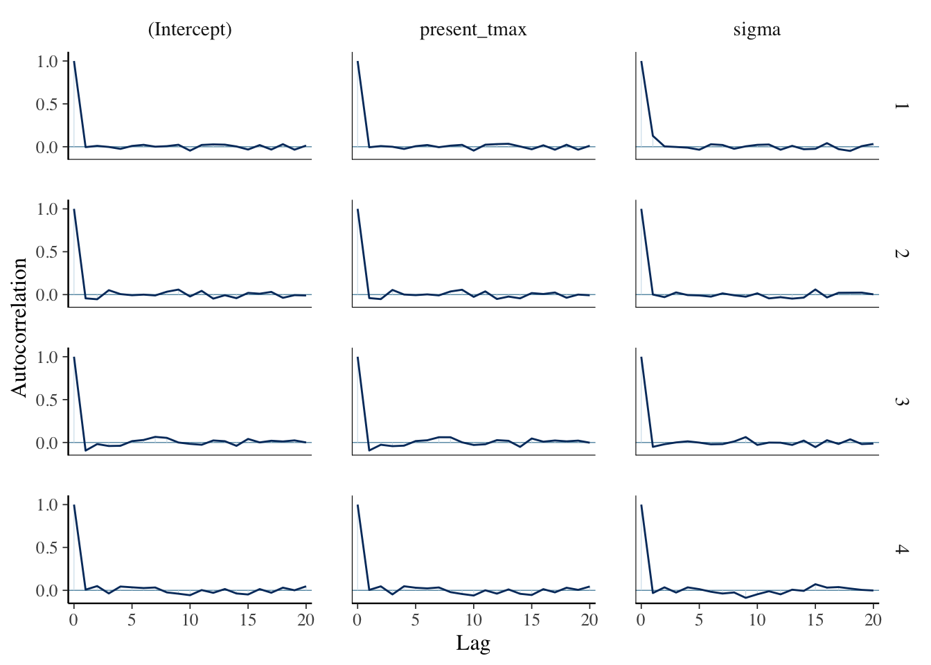
mcmc_dens_chains(temp_mod)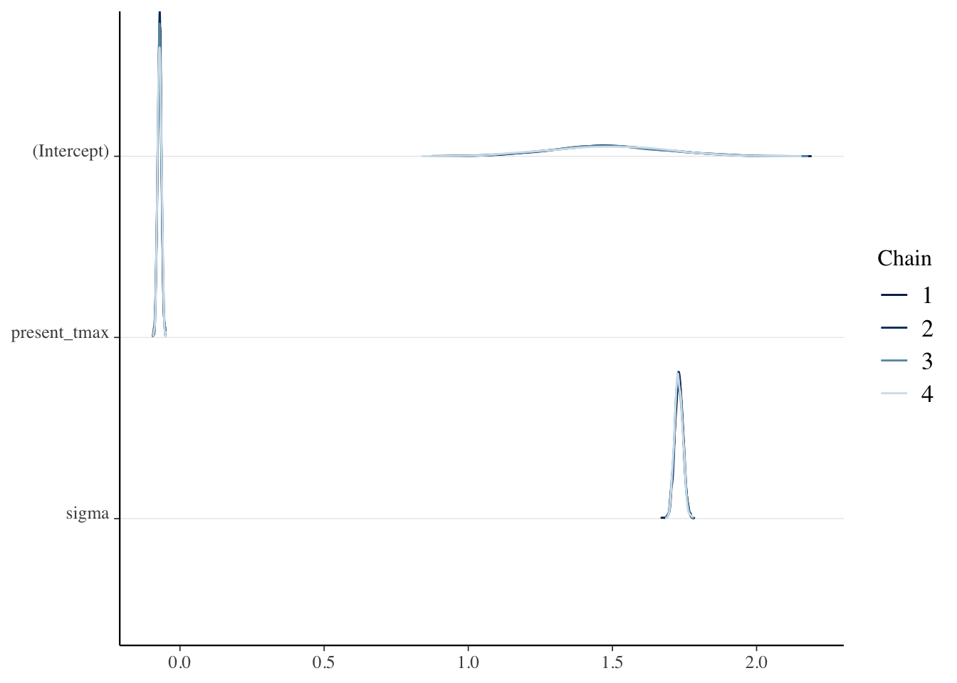
Now, what we are interested in are the Residuals, which are the differences between the predicted values of the model and the observed values. These are kind of estimates for \(\epsilon_i\), we would hope that they wouldn’t be too dependent, whatever that means.
seoul$residuals <- residuals(temp_mod)Now, if we plot the residuals from station 1 versus the residuals from station 2, we see that they are highly correlated.
seoul %>%
  filter(station %in% 1:2) %>%
  select(station, residuals, date) %>%
  tidyr::pivot_wider(names_from = station, values_from = residuals) %>%
  janitor::clean_names() %>%
  ggplot(aes(x1, x2)) +
  geom_point()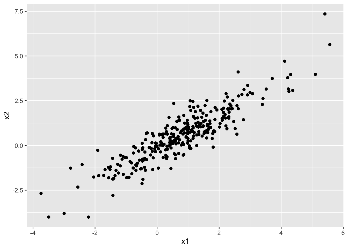
Therefore, it would be wrong to assume independence of the outcome from the other outcomes. Namely, outcomes are highly correlated with the other outcomes from nearby stations on the same day, even after accounting for the current day’s high temperature.
Here, we have an example of dependence on time. We consider again the weather data in Seoul.
seoul <- fosdata::seoulweather %>%
  mutate(date = lubridate::ymd(date))
We consider only station 2 and we model the high temperatures from July 1 through August 30, 2017.
small_seoul <- seoul %>%
  filter(
    station == 2,
    date >= lubridate::ymd("2017-Jul-01"),
    date <= lubridate::ymd("2017-Aug-30")
  )
small_seoul %>%
  ggplot(aes(x = date, y = present_tmax)) +
  geom_point() +
  geom_smooth(method = "lm")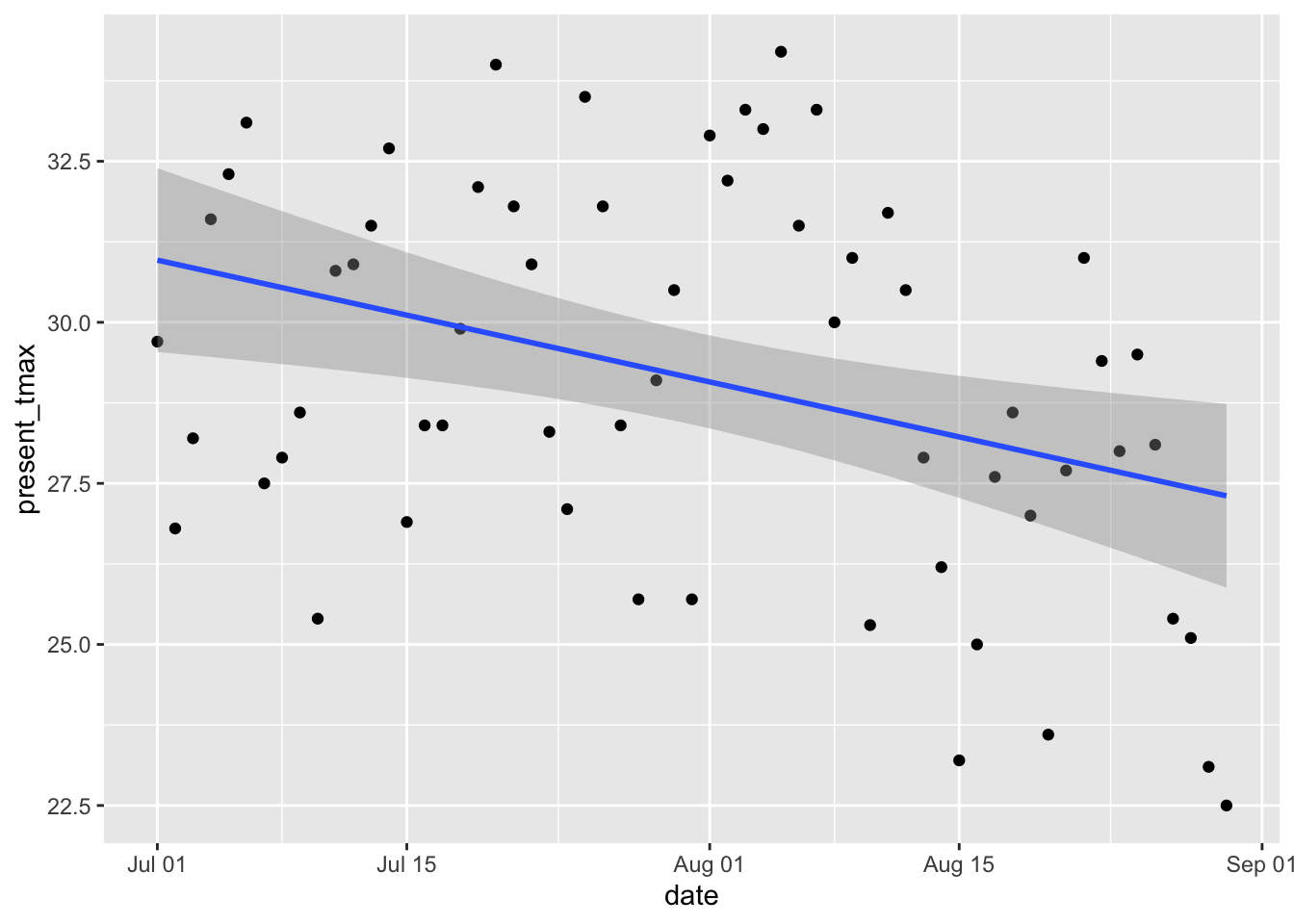
The data looks plausibly linear.
high_model <- rstanarm::stan_glm(present_tmax ~ date,
  data = small_seoul,
  refresh = 0
)
Let’s look at the residuals versus time observed:
plot(residuals(high_model))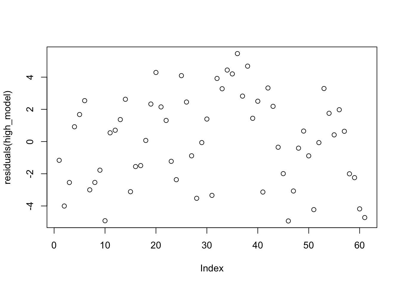
That doesn’t look bad.
If you are used to plot(mod) from lm, then the plot we just created is not the residuals versus fitted plot. It is the residuals versus the order the data was collected. To get residuals versus fitted, you would use
plot(fitted(high_model), residuals(high_model))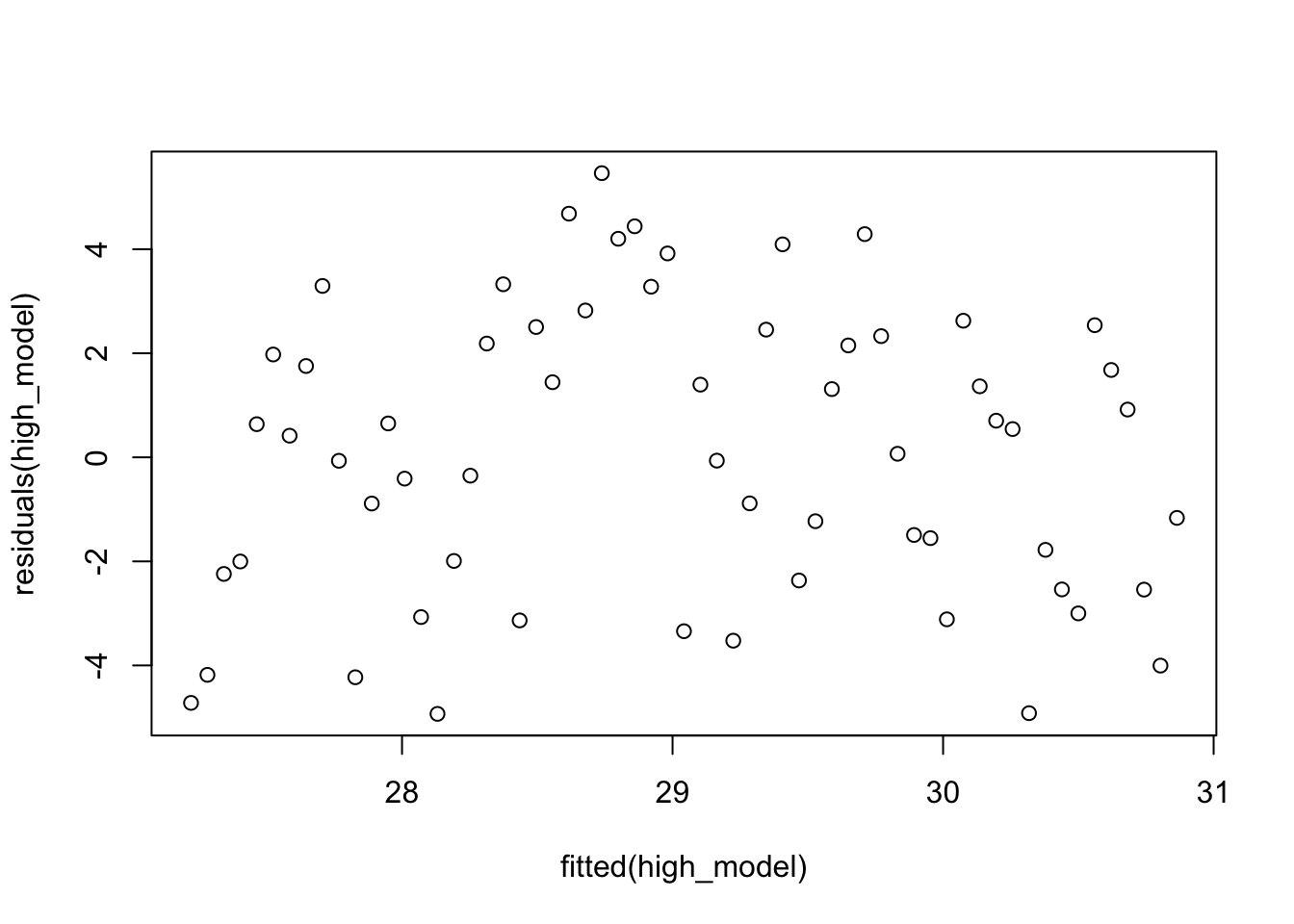
However, we know something about weather. If the temperature is higher than normal on one day, then more likely than not it will be higher than normal on the next day. So, the residuals could be autocorrelated, just like our MCMC samples were.
Let’s check by creating a correlogram:
acf(residuals(high_model))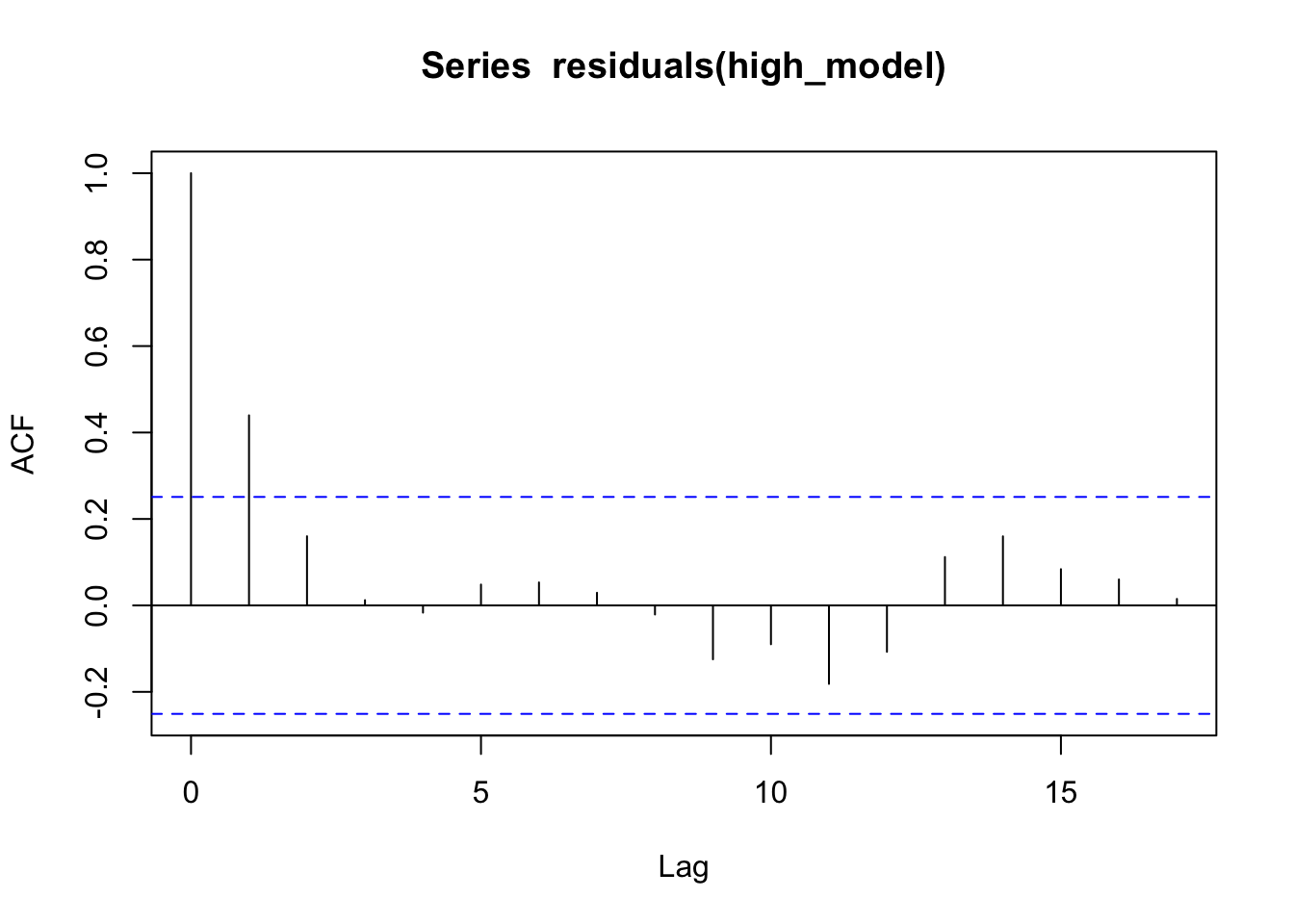
Yep, it seems knowing that one day is warmer (or cooler) than typical gives information about whether the next day will be warmer (or cooler) than typical. One last thing we can do is plot the residuals of one day versus the residuals of the next.
rr <- residuals(high_model)
plot(rr, lag(rr))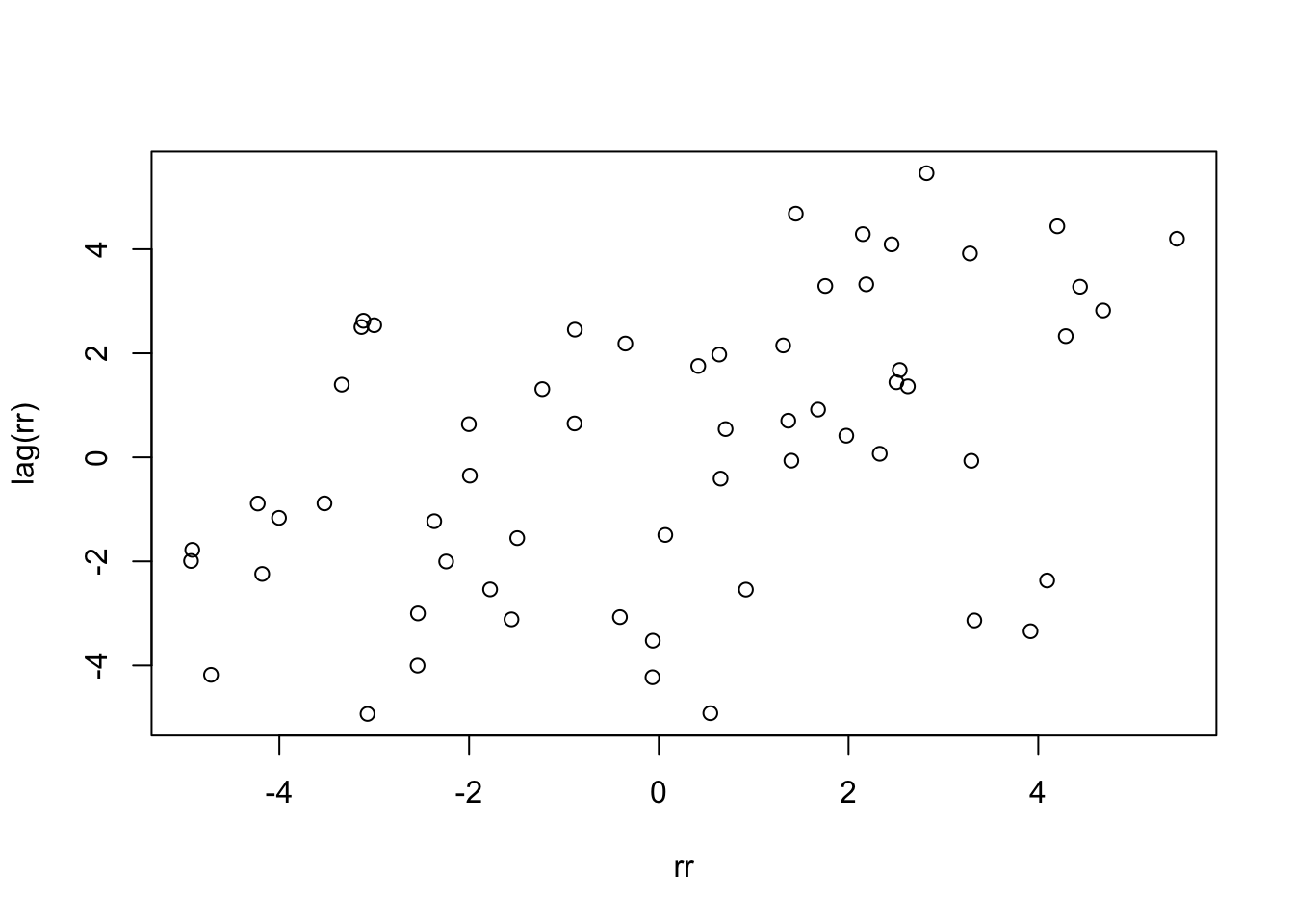
cor.test(rr, lag(rr))##
## Pearson's product-moment correlation
##
## data: rr and lag(rr)
## t = 3.857, df = 58, p-value = 0.0002904
## alternative hypothesis: true correlation is not equal to 0
## 95 percent confidence interval:
## 0.2235299 0.6331016
## sample estimates:
## cor
## 0.45181It is not clear how much this will affect our model, but it is clear that the model does not accurately describe the data.
3.1.3 Linearity
To assess linearity, we often will plot the residual values versus the fitted values, and see if there is a trend. This is more useful when we have more than one predictor, because with just one predictor, we can also just examine the scatterplot of response versus predictor and see whether the relationship appears linear!
skulls <- fosdata::skull_geometry

ggplot(skulls, aes(x = age_mos, y = circumference_cm)) +
  geom_point() +
  geom_smooth(method = "lm", se = F)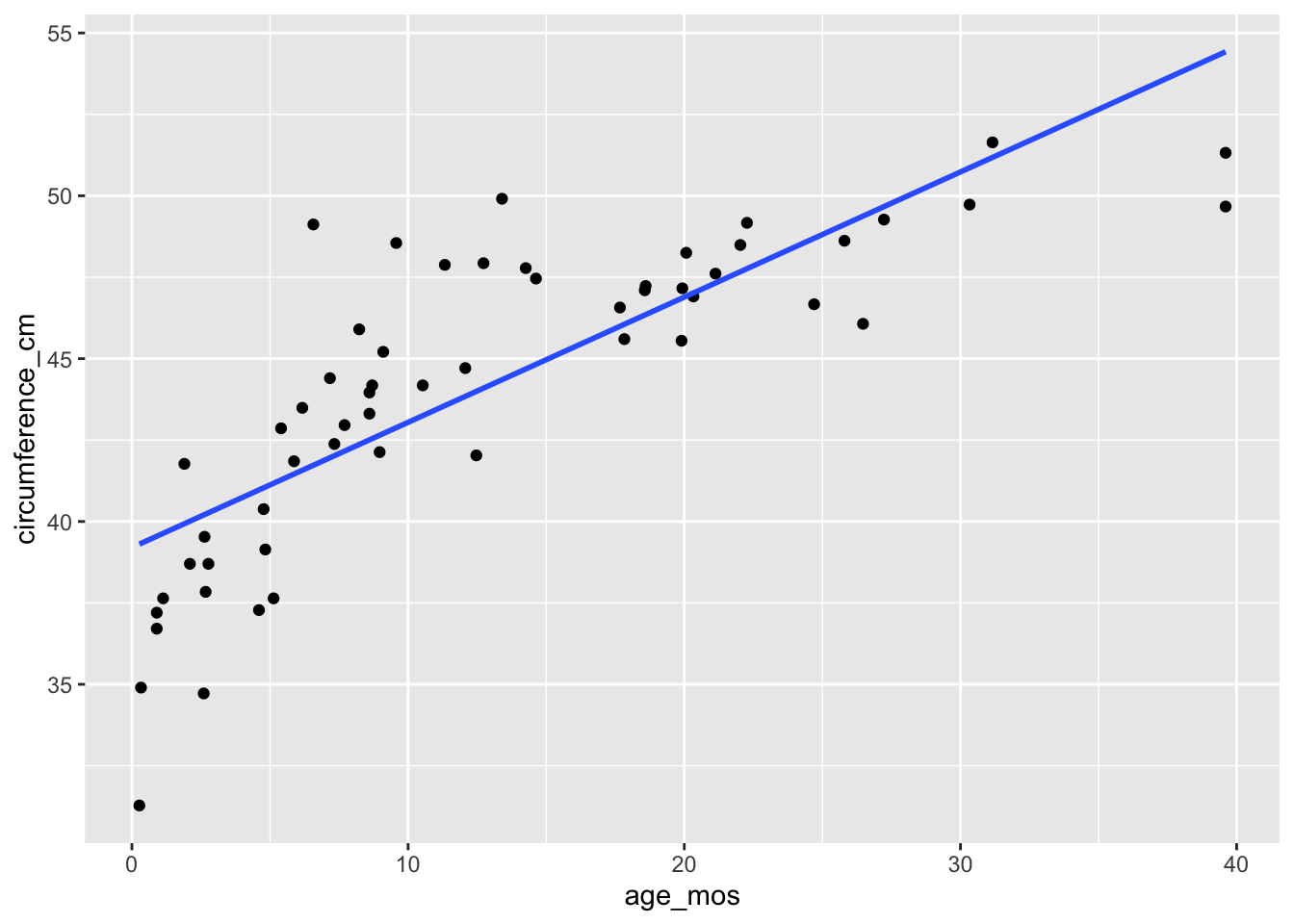
When we plot the residuals versus the fitted values, we see that the resulting plot has a U-shape. It can be useful to use geom_smooth to visualize the U-shape, but it can also be a little bit misleading sometimes.
skull_model <- rstanarm::stan_glm(circumference_cm ~ age_mos,
  data = skulls,
  refresh = FALSE
)

skulls %>%
  mutate(
    residuals = residuals(skull_model),
    fitted = fitted(skull_model)
  ) %>%
  ggplot(aes(x = fitted, y = residuals)) +
  geom_point() +
  geom_smooth(se = F)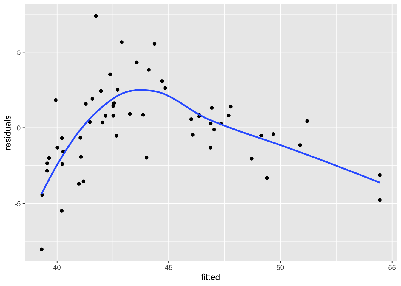
3.1.4 Normal errors
We will return to this example later in these notes. Consider the soccer player birthdays that we looked at previously.
ss <- read.csv("/Users/speegled/Documents/teachingold/Fall2021/4880/data/soccer_bdays.csv")Suppose we wanted to model the number of players born on a given day of the year as a linear function of the day of year.
ggplot(ss, aes(x = DayNoDual, y = count)) +
  geom_point() +
  geom_smooth(method = "lm", se = F)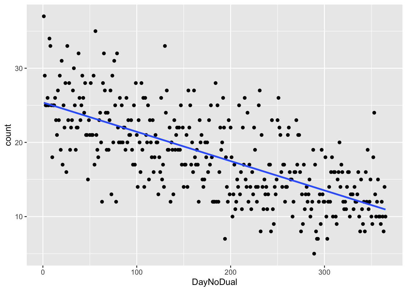
We use stan.
soccer_model <- "
data {
  int n;
  vector[n] y;
  vector[n] x;
}
parameters {
  real<lower = 0> sigma;
  real beta0;
  real beta1;
}
model {
  y ~ normal(beta0 + beta1 * x, sigma);
  beta0 ~ normal(25, 25);
  beta1 ~ normal(0, 2);
  sigma ~ uniform(1.0/100.0, 1000);
}
"
bayes_soccer_model <- rstan::stan(
model_code = soccer_model,
data = list(
n = nrow(ss),
x = ss$DayNoDual,
y = ss$count
),
refresh = 0,
seed = 4880,
iter = 5000 * 2
)bayesplot::mcmc_acf(bayes_soccer_model)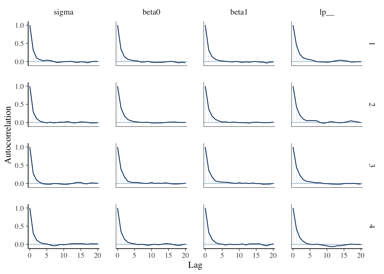
bayesplot::mcmc_dens_chains(bayes_soccer_model, pars = "beta1")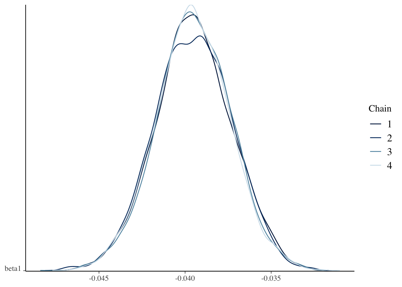
Let’s get a 99 percent credible interval for the number of players born on the last day of the year in a different professional soccer league.
library(tidybayes)
spread_draws(bayes_soccer_model, beta0, beta1, sigma) %>%
  mutate(val = rnorm(n(), beta0 + beta1 * 365, sigma)) %>%
  summarize(hdi = HDInterval::hdi(val, credMass = 0.99))
## # A tibble: 2 × 1
## hdi
## <dbl>
## 1 -0.847
## 2 22.2We see an issue with the 99 percent credible interval; namely, it is \([-1, 22]\). We know there can’t be a negative number of babies born on a day, so this is a problem. One reason this comes up is that the error isn’t normal. We will see how to deal with non-normal errors next chapter.
3.2 Posterior Predictions
Let’s return to the mean retinal thickness model we built earlier.
dd <- readr::read_delim("data/S1Dataset.csv", ",", locale = readr::locale(decimal_mark = ",")) %>%
  janitor::clean_names()

dd <- dd %>%
  mutate(onl_mean = (onl_inner + onl_outer) / 2)


bayes_model <- rstanarm::stan_glm(onl_mean ~ age,
  data = dd,
  family = "gaussian",
  refresh = 0
)
3.2.1 Posterior Predictive Sample
Let’s create a posterior predictive sample of the retinal thickness for new patients that are 28 years old, and plot the density estimation plus the first value for the observed patient who was 28 years old.
library(tidybayes)
spread_draws(bayes_model, `[\\(a-z].*`, regex = T) %>%
  select(!matches("_$")) %>%
  janitor::clean_names() %>%
  mutate(val = rnorm(n(), intercept + age * 28, sigma)) %>%
  ggplot(aes(x = val)) +
  geom_density() +
  geom_vline(xintercept = dd$onl_mean[1], linetype = "dashed")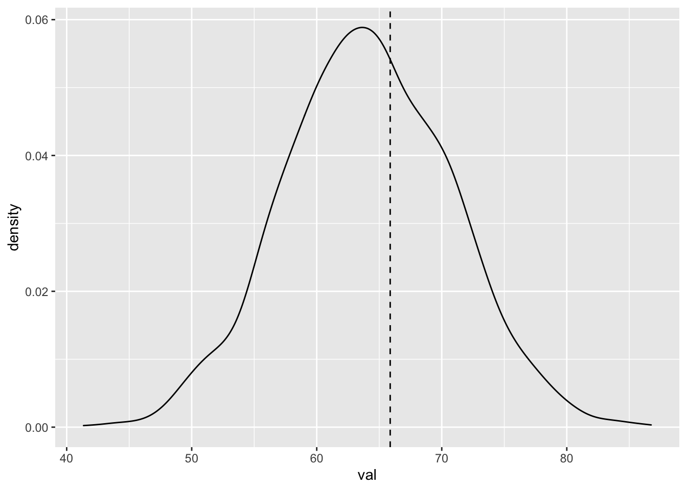
We could also plot vertical lines that correspond to all eight 28 year olds.
twenty_eight <- dd %>% filter(age == 28)
spread_draws(bayes_model, `[\\(a-z].*`, regex = T) %>%
  select(!matches("_$")) %>%
  janitor::clean_names() %>%
  mutate(val = rnorm(n(), intercept + age * 28, sigma)) %>%
  ggplot(aes(x = val)) +
  geom_density() +
  geom_vline(xintercept = twenty_eight$onl_mean, linetype = "dashed")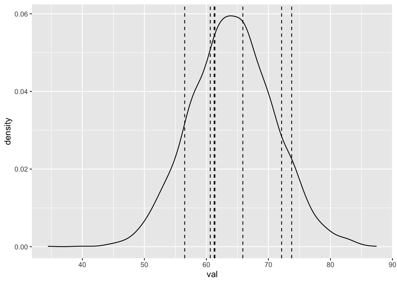
Alternatively, we could have used the rstanarm function posterior_predict as follows to get a matrix of posterior predictions. Matrices don’t work as well with ggplot, so we use the base R density and plot.
rstanarm::posterior_predict(bayes_model, newdata = data.frame(age = 28)) %>%
  density() %>%
  plot() %>%
  abline(v = twenty_eight$onl_mean, lty = 2)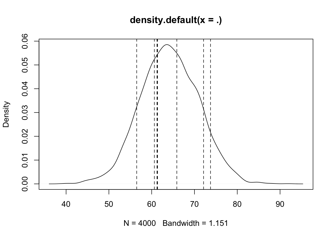
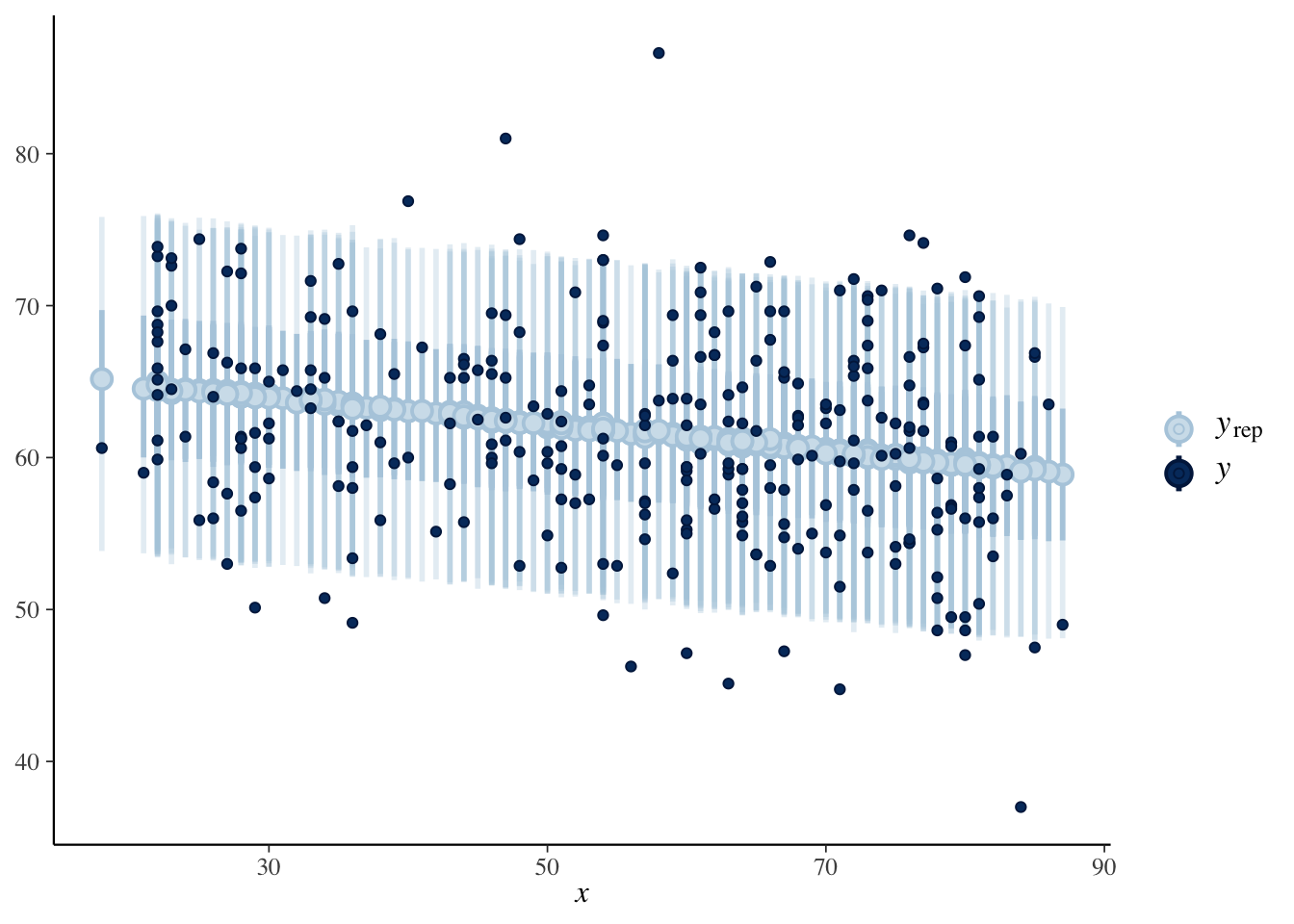
If we want to visualize this acros all values that occured, we can modify the scatterplot of the original data to include bands that indicate the relative likelihood of the responses according to our model using the bayesplot function ppc_intervals. This function doesn’t play well with repeatd \(x\)-values like we have here, and can produce an error sporadically. The bands for values that have repeated values also have different darknesses, so this plot is really just for yourself tp look at and not presentation quality when there are repeated \(x\)-values, but it is a cool visualization when it works.
set.seed(4880)
predictions <- rstanarm::posterior_predict(bayes_model, newdata = dd)

bayesplot::ppc_intervals(
  y = dd$onl_mean,
  x = dd$age,
  yrep = predictions,
  prob = 0.5,
  prob_outer = 0.9
)
One last check we can do is to get predictions for the response over all values of the predictor, and compare the estimated densities. As a reminder, the estimate density of the response is
ggplot(dd, aes(x = onl_mean)) +
  geom_density()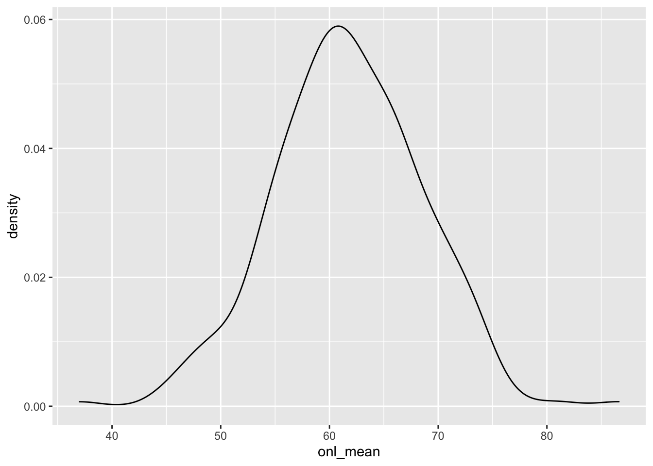
To get a predicted response, we could do a single draw from the posterior and compute the response for those values of the estimated parameters. This is a little bit tricky to do.
spread_draws(bayes_model, `[\\(a-z].*`, regex = T, ndraws = 1) %>%
  select(!matches("_$")) %>%
  janitor::clean_names() %>%
  summarize(intercept, age, sigma, age_val = dd$age) %>%
  mutate(onl_mean = rnorm(n(), intercept + age * age_val, sigma)) %>%
  ggplot(aes(x = onl_mean)) +
  geom_density(color = "lightblue")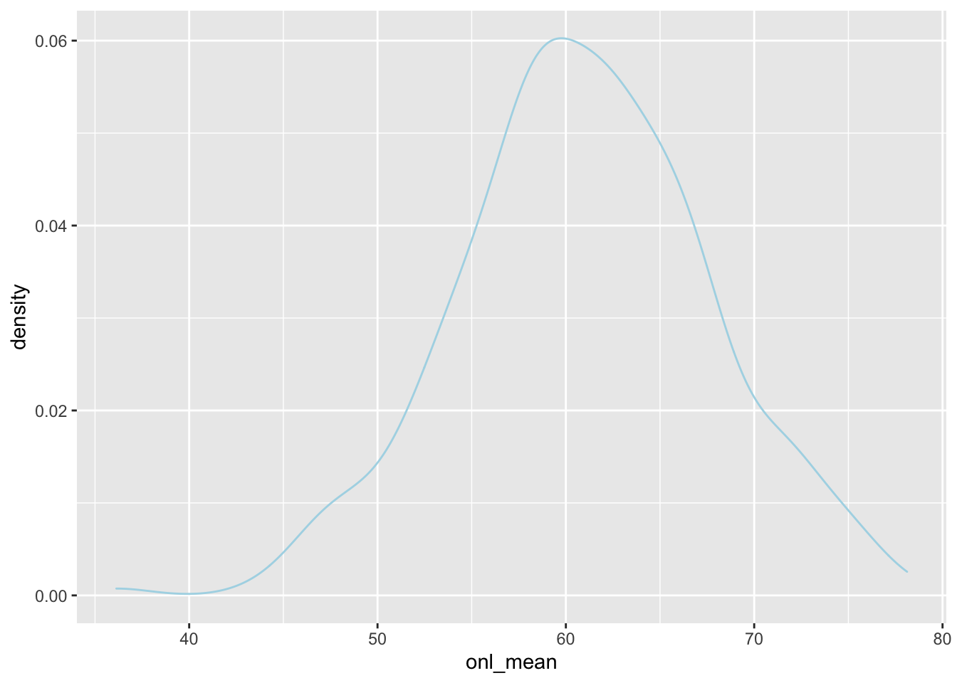
Here, we plot 50 of these on top of one another and compare that to the density plot of the response, which is black.
spread_draws(bayes_model, `[\\(a-z].*`, regex = T, ndraws = 50) %>%
  select(!matches("_$")) %>%
  janitor::clean_names() %>%
  group_by(draw) %>%
  summarize(intercept, age, sigma, age_val = dd$age, .groups = "drop") %>%
  mutate(onl_mean = rnorm(n(), intercept + age * age_val, sigma)) %>%
  ggplot(aes(x = onl_mean, group = factor(draw))) +
  geom_density(color = "lightblue") +
  geom_density(data = dd, mapping = aes(x = onl_mean, group = NULL))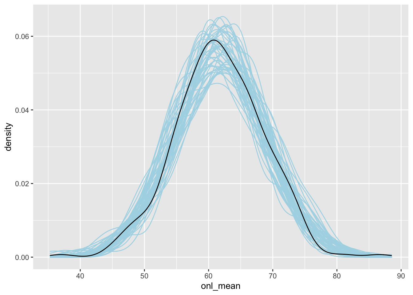
As usual, there is a built-in R function that will do this for us, which works a bit easier.
bayesplot::pp_check(object = bayes_model)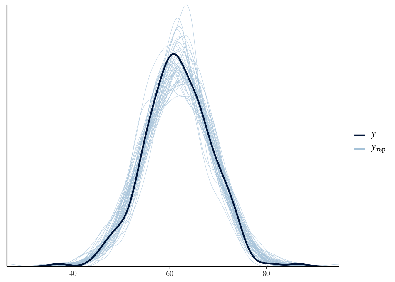
3.2.2 Cross Validation
Read about cross-validation in the context of regression here. This is well-written and I don’t see any reason to rehash it here.
Let’s see how to run it and interpret it.
cv_procedure <- bayesrules::prediction_summary_cv(data = dd, model = bayes_model, k = 10)
cv_procedure$folds
## fold mae mae_scaled within_50 within_95
## 1 1 3.096871 0.4570823 0.6666667 0.9666667
## 2 2 5.081746 0.7468652 0.4333333 0.9666667
## 3 3 5.290787 0.7993779 0.4482759 0.9655172
## 4 4 4.638525 0.6969170 0.5000000 0.9666667
## 5 5 2.482068 0.3590774 0.8000000 0.9666667
## 6 6 5.468485 0.8532371 0.4137931 0.8275862
## 7 7 5.935607 0.8907335 0.3333333 0.9333333
## 8 8 4.939096 0.7240213 0.4827586 1.0000000
## 9 9 4.638676 0.7037484 0.4333333 0.9666667
## 10 10 2.808838 0.4136138 0.5666667 0.9666667When we look at the folds, we see that we get around 50 percent of future values are within the 50 percent posterior predictive interval, and about 95 percent of future values are within the 95 percent posterior predictive value. This is evidence that our model is working well.
cv_procedure$cv## mae mae_scaled within_50 within_95
## 1 4.43807 0.6644674 0.5078161 0.9526437When we average across all of the folds, we see tht we have pretty a pretty good match for 50 percent and 95 percent posterior predictive intervals.
We end with a note about data that has been collected sequentially over time. If your goal is to predict the next time increment, then the cross-validation technique above will not give you accurate estimates of the error. Instead, we could see how the next day predictions work when we build our model based on the data up to a specified day. We consider the bikes data set.
First we cut off our data after 400 observations, and predict the value of the 401st.
library(bayesrules)
data("bikes")

bike_shor <- bikes[1:400, ]
bike_model <- rstanarm::stan_glm(rides ~ temp_feel,
  data = bike_shor,
  refresh = 0
)
If we knew exactly what the temperature on the next day was going to be, we could then get a 75 percent posterior prediction interval for the number of rides on the next day.
spread_draws(bike_model, temp_feel, `(Intercept)`, sigma) %>%
  mutate(val = rnorm(
    n(),
    `(Intercept)` + bikes$temp_feel[401] * temp_feel,
    sigma
  )) %>%
  pull(val) %>%
  quantile(c(.125, .875))
## 12.5% 87.5%
## 3162.900 5613.066The true number of rides was:
bikes$rides[401]## [1] 5554which is between the two values (barely).
We repeat this for every day from 400-499 to see whether about 75 percent of the ride values are within the 75 percent posterior prediction interval.
library(future.apply)
plan("multisession")
tf <- future.apply::future_sapply(400:499, function(x) {
  bike_shor <- bikes[1:x, ]
  bike_model <- rstanarm::stan_glm(rides ~ temp_feel,
    data = bike_shor,
    refresh = 0
  )
  quant <- spread_draws(bike_model, temp_feel, `(Intercept)`, sigma) %>%
    mutate(val = rnorm(
      n(),
      `(Intercept)` + bikes$temp_feel[x + 1] * temp_feel,
      sigma
    )) %>%
    pull(val) %>%
    quantile(c(.125, .875))
  bikes$rides[x + 1] < quant[2] && bikes$rides[x + 1] > quant[1]
})
plan("sequential")
mean(tf)
## [1] 0.35That’s not very good! It would ideally be close to 75 percent. Let’s re-do this using leave one out cross validation to see what percentage that gave.
tf <- future_sapply(1:500, function(x) {
  bikes_short <- bikes[-x, ]
  bayes_model <- rstanarm::stan_glm(rides ~ temp_feel,
    data = bikes_short,
    refresh = 0
  )
  interval <- spread_draws(bayes_model, temp_feel, `(Intercept)`, sigma) %>%
    janitor::clean_names() %>%
    mutate(val = rnorm(n(), intercept + temp_feel * bikes$temp_feel[x], sigma)) %>%
    pull(val) %>%
    quantile(c(.125, .875))
  bikes$rides[x] < interval[2] && bikes$rides[x] > interval[1]
}, future.seed = NULL)

mean(tf)
## [1] 0.728That is just about right. This confirms that our technique is OK, and it also says that this model passes this test. If you wanted to use it to, say, impute missing data in the middle of a data set, then it would be reasonable.
3.3 Exercises
Analyze the coffe_ratings data set in the bayesrules package to determine the dependence of model rating (total_cup_points) on aroma, and separately on aftertaste, and compare the two models.
Consider Section 10.6.2 as a guide for possible things that you can do. You do not need to do all parts of every problem in section 10.6.2, but most parts of most questions should be contained somewhere in your exposition.
I will grade this exercise on completeness and correctness (50%) and on organization and persuasiveness (50%). Be sure to include enough text that your argument is persuasive.