Chapter 2 Linear Models
In this chapter, we discuss linear models from a Bayesian perspective. For review on simple linear regression from STAT 3850, see here.
2.1 First Example Using Stan
We will use data from this paper, which describes how the thickness of the retina changes with age. The authors of the study write: “New optical coherence tomography (OCT) techniques are excellent tools for the noninvasive, in vivo, high-resolution visualization of the retina. Such tools can be used to monitor retinal thickness in the region of the macula as this measurement is useful for the diagnosis and follow up of many macular and optic nerve disorders. It is, therefore, important that we can distinguish between pathological changes and those associated with age.”
You can download the data set here. It is one of the cleaner files that I have seen “in the wild,” we will only need to clean the names of the data and convert from comma decimals to our period decimals.
dd <- read.csv("data/S1Dataset.csv")
dd <- dd %>%
  mutate(across(.fns = function(x) str_replace(x, ",", "."))) %>%
  mutate(across(.fns = function(x) as.numeric(x))) %>%
  janitor::clean_names()
head(dd)
## sex age r_central r_inner r_outer rnfl_central rnfl_inner rnfl_outer
## 1 0 28 293 332.75 293.50 16 20.75 30.50
## 2 0 27 220 320.00 295.00 7 21.00 40.75
## 3 0 55 271 325.50 282.00 12 22.50 32.25
## 4 0 60 263 321.25 278.75 13 21.25 34.75
## 5 0 57 220 320.00 287.25 6 20.25 31.00
## 6 0 67 226 324.50 291.00 11 25.00 44.50
## cg_central gcl_inner gcl_outer pli_central ipl_inner ipl_outer
## 1 28 41.25 29.00 28 41.25 29.00
## 2 17 39.25 28.00 17 39.25 28.00
## 3 21 40.50 28.75 21 40.50 28.75
## 4 14 51.00 35.00 22 41.50 27.50
## 5 7 47.75 36.00 15 41.50 29.00
## 6 14 48.25 32.00 20 39.00 26.00
## ni_central inl_inner inl_outer opl_central opl_inner opl_outer
## 1 24 36.25 32.50 29 34.00 28.00
## 2 12 39.50 32.75 21 35.50 27.25
## 3 26 36.00 30.75 27 32.75 30.00
## 4 13 34.50 29.25 27 34.50 28.75
## 5 12 37.75 32.50 17 32.50 27.75
## 6 8 35.25 30.25 12 33.00 28.00
## onl_central onl_inner onl_outer epr_central rpe_inner rpe_outer
## 1 83 70.00 61.75 21 15.75 14.00
## 2 71 60.00 55.25 18 15.25 14.25
## 3 87 67.50 51.50 20 15.75 12.50
## 4 89 61.25 49.25 19 14.50 12.75
## 5 81 64.00 55.25 16 14.25 13.25
## 6 86 62.75 46.75 19 16.50 14.25
## fr_central fr_inner fr_outer
## 1 91 80.00 77.50
## 2 86 78.25 77.00
## 3 87 78.50 74.25
## 4 87 77.00 74.75
## 5 84 76.75 75.50
## 6 90 82.50 78.75OR check this out:
dd <- readr::read_delim("data/S1Dataset.csv", ",", locale = readr::locale(decimal_mark = ",")) %>%
  janitor::clean_names()
The data consists of 297 observations of 29 variables. We are interested in the relationship between the mean thickness of the outer nuclear layer and age. We follow the authors of the paper by taking the mean of the inner and outer ONL, but ignoring the central.
dd <- dd %>%
  mutate(onl_mean = (onl_inner + onl_outer) / 2)

ggplot(dd, aes(x = age, y = onl_mean)) +
  geom_point() +
  geom_smooth(method = "lm", se = FALSE)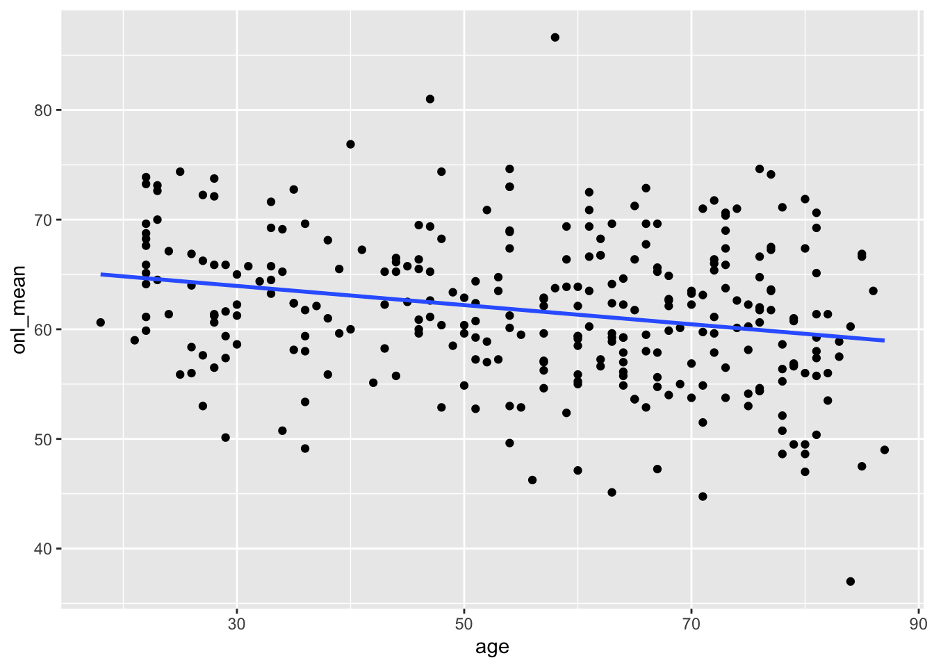
If you remember from STAT 3850, this data looks like a reasonable candidate for simple linear regression; that is, linear regression with one predictor variable.
Our model is \(Y = \beta_0 + \beta_1 x + \epsilon\), where \(Y\) is the mean ONL, \(x\) is the age, and \(\epsilon\) is normally distributed error term with mean 0 and unknown standard deviation. Note that we can rewrite this as \[ Y = \mathrm{normal}(\beta_0 + \beta_1 x, \sigma) \] That is, \(Y\) is normally distributed with mean \(\beta_0 + \beta_1 x\) and unknown standard deviation \(\sigma\). We can incorporate this into our stan model as follows or here:
data {
  int<lower=0> n;
  vector[n] y;
  vector[n] x;
}

parameters {
  real beta0;
  real beta1;
  real<lower=0> sigma;
}

model {
  y ~ normal(beta0 + beta1 * x, sigma);
  sigma ~ uniform(1/10.0, 100);
  beta0 ~ normal(0, 100);
  beta1 ~ normal(0, 100);
}
bayes_model <- rstan::stan(
"stan_models/linear_regression.stan",
data = list(
y = dd$onl_mean,
x = dd$age,
n = nrow(dd)
),
iter = 5000 * 2,
seed = 4880,
refresh = 0
)sim_data <- as.array(bayes_model, pars = c("beta0", "beta1", "sigma"))
mcmc_dens_chains(sim_data, pars = "beta0")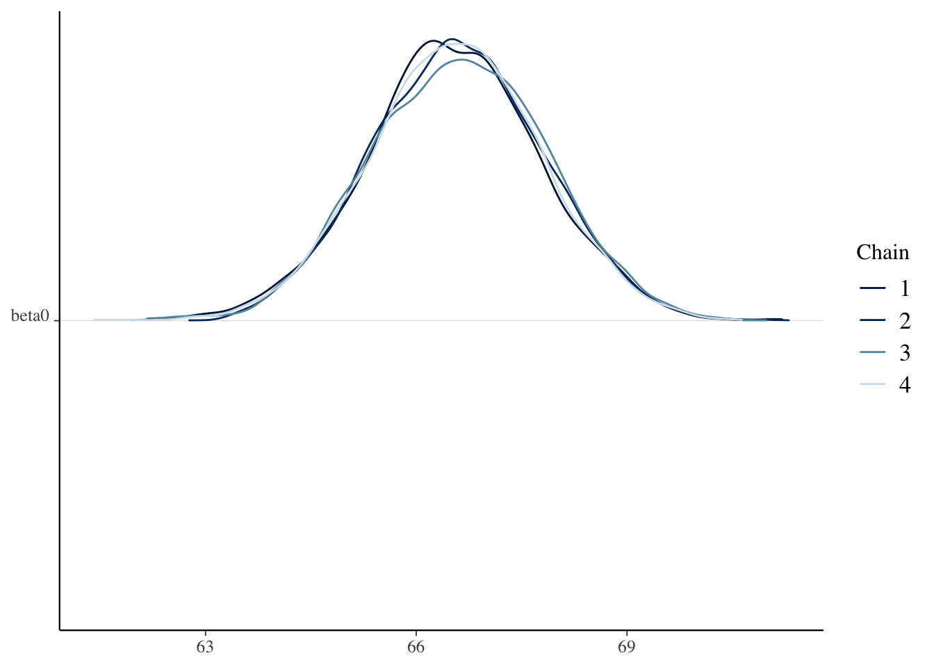
mcmc_dens_chains(sim_data, pars = "beta1")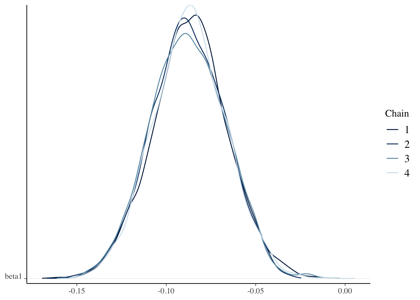
mcmc_dens_chains(sim_data, pars = "sigma")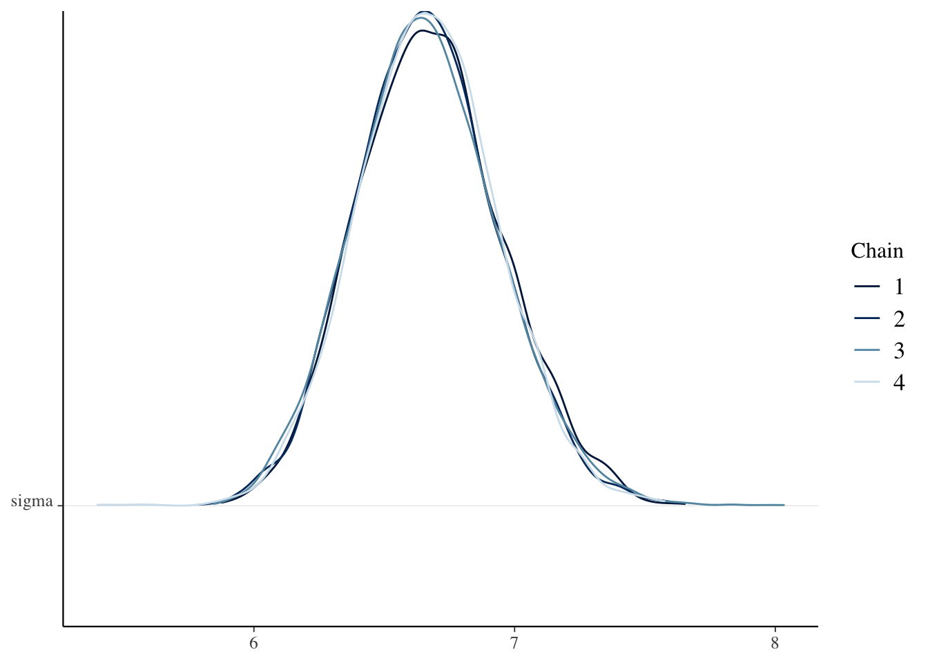
mcmc_acf(sim_data)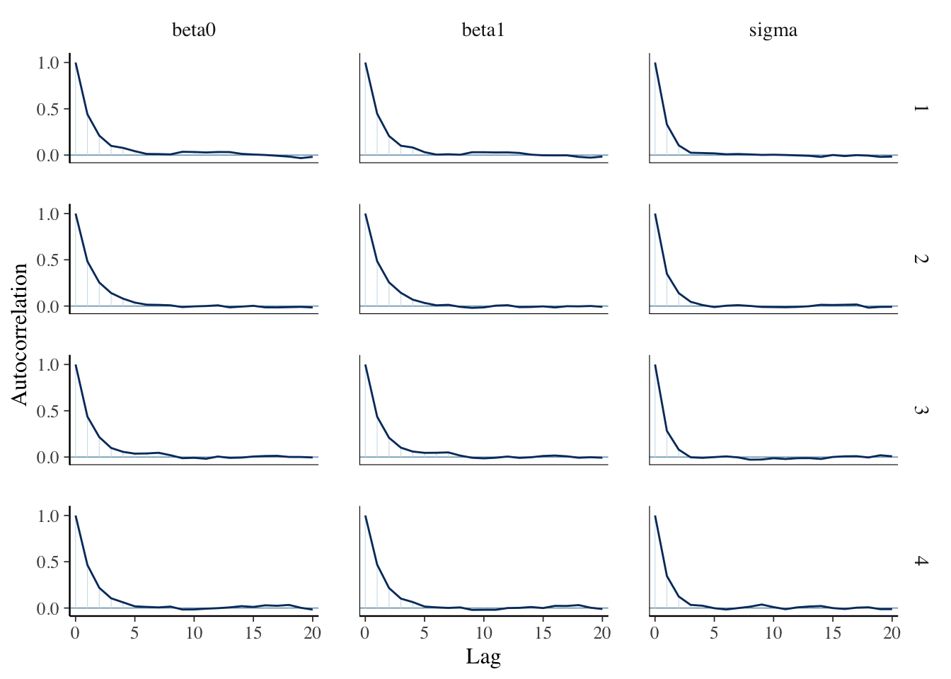
Check the Rhat and effective sample sizes of the parameters and make sure they are OK.
Compute a 95 percent credible interval for the slope.
We use hdi as follows:
HDInterval::hdi(sim_data[, , "beta1"])## chains
## chain:1 chain:2 chain:3 chain:4
## lower -0.12817165 -0.12693141 -0.12650750 -0.1268305
## upper -0.04580915 -0.04701053 -0.04601267 -0.0462310
## attr(,"credMass")
## [1] 0.95All four chains agree, and our credible interval is \([-.127, -.046]\):
HDInterval::hdi(as.vector(sim_data[, , "beta1"]))## lower upper
## -0.12704582 -0.04611236
## attr(,"credMass")
## [1] 0.95This says that the ONL thickness decreases by between .046 and .127 {}m per year with probability of 95 percent.
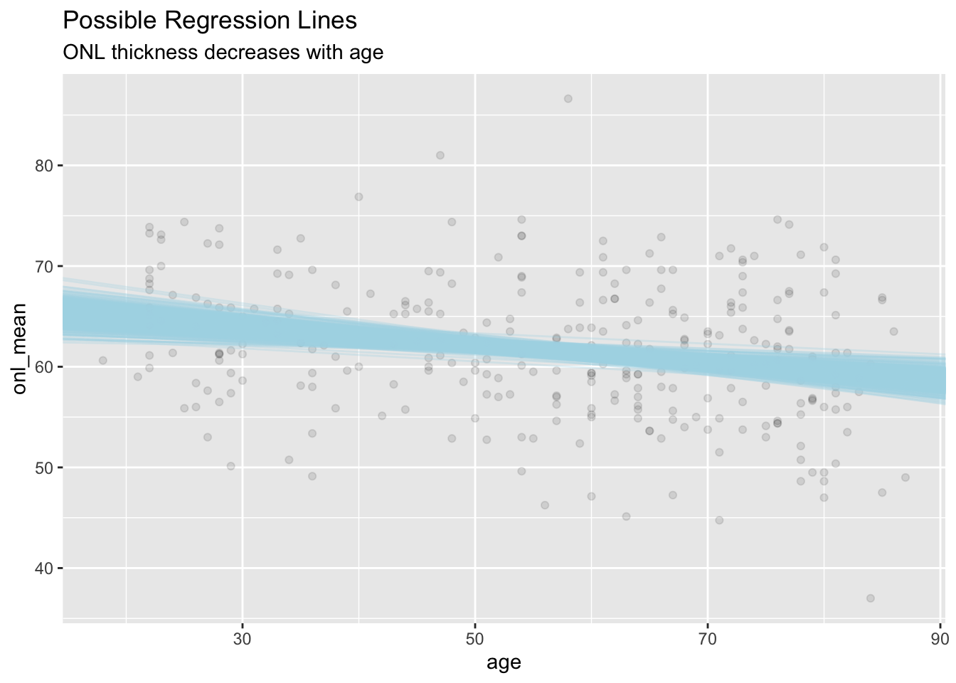
Create a sample of 500 possible regression lines and visualize it.
This is a nice exercise to see what the other possible regression lines could have been. Let’s look at our posterior simulation again:
head(sim_data)## , , parameters = beta0
##
## chains
## iterations chain:1 chain:2 chain:3 chain:4
## [1,] 66.34906 65.92430 64.68168 66.41922
## [2,] 66.32601 65.65010 65.71839 66.47427
## [3,] 66.32917 65.74389 65.46925 67.35456
## [4,] 63.38956 66.81451 66.70305 66.29095
## [5,] 66.68803 67.06080 65.54083 68.19873
## [6,] 67.34094 67.04045 66.54341 68.67942
##
## , , parameters = beta1
##
## chains
## iterations chain:1 chain:2 chain:3 chain:4
## [1,] -0.07874451 -0.07810108 -0.06491157 -0.08436891
## [2,] -0.08371694 -0.06564473 -0.06258929 -0.07814828
## [3,] -0.07590343 -0.06310877 -0.06618099 -0.09295832
## [4,] -0.03906760 -0.09053576 -0.08735985 -0.09591326
## [5,] -0.09655002 -0.09915027 -0.07150441 -0.12757391
## [6,] -0.08880660 -0.10573600 -0.08384904 -0.11915363
##
## , , parameters = sigma
##
## chains
## iterations chain:1 chain:2 chain:3 chain:4
## [1,] 6.367617 6.626209 6.896260 6.994621
## [2,] 6.385628 6.556554 6.726507 6.382063
## [3,] 6.335225 6.596559 6.707983 6.430057
## [4,] 6.909914 6.649822 6.398843 6.604254
## [5,] 6.640358 6.647487 6.554602 7.035233
## [6,] 6.520033 6.646991 6.944566 7.074473As before, these values are paired in the sense that each \(\beta_0\) goes with a specific \(\beta_1\). We will see later that the \((\beta_0, \beta_1)\) pairs are generally quite correlated. Perhaps you can think about why this should be, now.
So, it I wanted to plot a single line, I could use
ggplot(dd, aes(age, onl_mean)) +
  geom_point(alpha = .1) +
  geom_abline(
    slope = sim_data[1, 1, "beta1"],
    intercept = sim_data[1, 1, "beta0"]
  )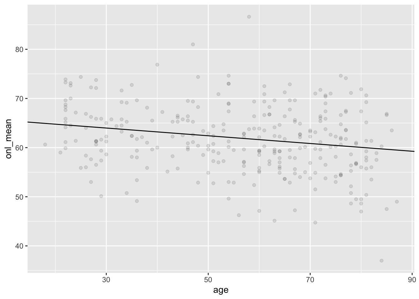
We set \(\alpha = .2\) so that the data points hide in the background a bit. If I want to plat 500 lines, that would give me an idea what the range of values are that were possible:
ggplot(dd, aes(age, onl_mean)) +
  geom_point(alpha = .1) +
  geom_abline(
    slope = sim_data[1:500, 1, "beta1"],
    intercept = sim_data[1:500, 1, "beta0"],
    alpha = .3,
    color = "lightblue"
  ) +
  labs(
    title = "Possible Regression Lines",
    subtitle = "ONL thickness decreases with age"
  )
If someone shows up who is 50 years old, find a 95 posterior prediction interval for their ONL.
To do this, we need to simulate a large sample of possible ONL thicknesses for someone who is 50. There are two sources of uncertainty: we don’t know the parameter values exactly, and even if we did, there is variability within all 50 year olds.
If we wanted to simulate an ONL thickness for a single 50 year old, we would use
rnorm(
  1,
  sim_data[1, 1, "beta0"] + 50 * sim_data[1, 1, "beta1"],
  sim_data[1, 1, "sigma"]
)
## [1] 70.3765If we want to get an idea about the interval of possible values, then we would need to create a large sample of possible thicknesses. Here, we create a sample of 5000 using the first chain.
fifty <- rnorm(
  5000,
  sim_data[1:5000, 1, "beta0"] + 50 * sim_data[1:5000, 1, "beta1"],
  sim_data[1:5000, 1, "sigma"]
)
head(fifty)
## [1] 59.11253 41.70425 61.33211 69.10132 59.47663 67.34325HDInterval::hdi(fifty)## lower upper
## 48.87543 75.51119
## attr(,"credMass")
## [1] 0.95We see that the ONL thickness of a 50 year old is between 48 and 74.5 with probability 95 percent.
Find the HDI for a fifty year old using the second chain and compare the answer to what we got in the previous example. Does it match?
We now consider a different question about 50 year olds. Find a 95 percent credible interval for the typical mean ONL of 50 year olds.
The difference between this example and the last one is that we are no longer interested in the individual variability of 50 year olds; we are only interested in the uncertainty in our parameter estimation.
The typical mean ONL of a 50 year old given \(\beta_0\) and \(\beta_1\) is \[ \beta_0 + 50 \beta_1 \] If we use our first values of \(\beta_0\) and \(\beta_1\) from the posterior, we get
sim_data[1, 1, "beta0"] + 50 * sim_data[1, 1, "beta1"]## [1] 62.41184To find a credible interval, we take a bunch of these and use hdi.
HDInterval::hdi(
  as.vector(sim_data[, , "beta0"] + 50 * sim_data[, , "beta1"])
)
## lower upper
## 61.41703 63.00556
## attr(,"credMass")
## [1] 0.95We see that we have a 95 percent credible interval of \([61.4, 63.0]\).
2.2 Using rstanarm
Let’s repeat the above analysis using rstanarm, which has an interface closer to we are used to with lm.
library(rstanarm)

bayes_model <- rstanarm::stan_glm(onl_mean ~ age,
  data = dd,
  family = "gaussian",
  refresh = 0
)
That’s a lot easier! The only trick is that we need to tell stan_glm to be sure to use a gaussian or normal family. We will understand more what that means when we see some different families that we may have used.
Let’s store the data into an array (we see that the default is a sample of size 1000 from the posterior distribution of the parameters) and do some diagnostics:
sim_data <- as.array(bayes_model)

mcmc_acf(sim_data)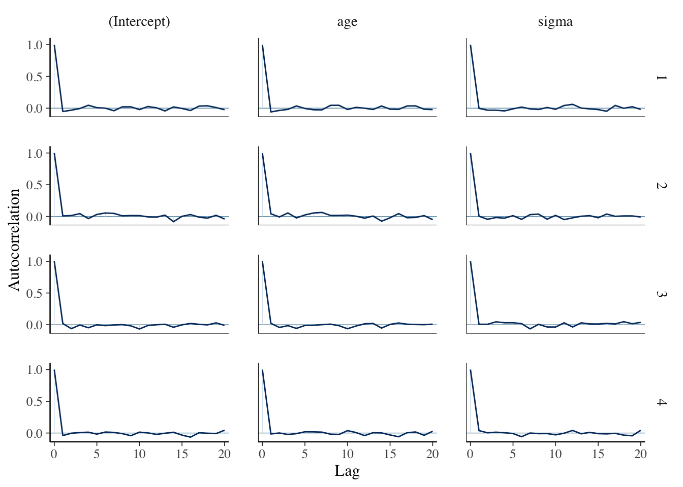
mcmc_dens_chains(sim_data, pars = "age")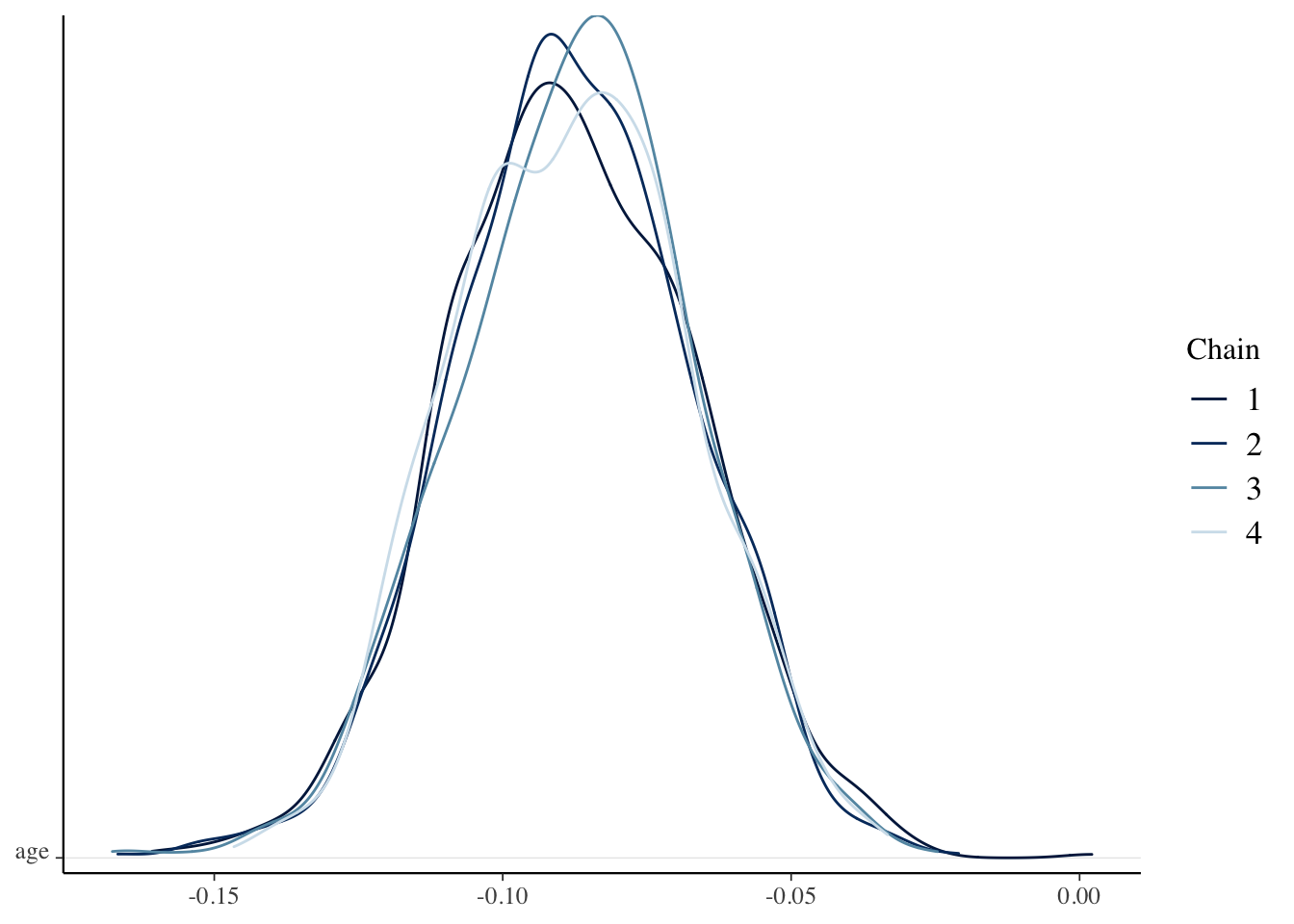
coda::effectiveSize(sim_data[, , "age"])## chain:1 chain:2 chain:3 chain:4
## 1124.641 1000.000 1000.000 1000.000We see that the diagnostics are much better here than they were when we built the model ourselves. That is because stan_glm does some optimizing that we did not do, and which we won’t get into. However, the bottom lines are more or less the same as what we did. Compare, for example, the 95 percent credible interval for the slope to what we obtained above:
HDInterval::hdi(as.vector(sim_data[, , "age"]))## lower upper
## -0.12759147 -0.04970856
## attr(,"credMass")
## [1] 0.95Compute a 95 percent posterior prediction interval for the mean ONL length of a single 50 year old patient who presents. Compare to the value we computed in Example 2.3.
What were the priors that rstanarm chose for our parameters?
Notice that we didn’t provide any priors to rstanarm, it computed them itself. Let’s see how we can figure out what priors it used.
prior_summary(bayes_model)## Priors for model 'bayes_model'
## ------
## Intercept (after predictors centered)
## Specified prior:
## ~ normal(location = 62, scale = 2.5)
## Adjusted prior:
## ~ normal(location = 62, scale = 17)
##
## Coefficients
## Specified prior:
## ~ normal(location = 0, scale = 2.5)
## Adjusted prior:
## ~ normal(location = 0, scale = 0.91)
##
## Auxiliary (sigma)
## Specified prior:
## ~ exponential(rate = 1)
## Adjusted prior:
## ~ exponential(rate = 0.15)
## ------
## See help('prior_summary.stanreg') for more detailsThe priors that rstanarm chose were as given below:
sigma ~ exponential(rate = 0.15)
beta0 ~ normal(62, 17)
beta1 ~ normal(0, 0.91)
Note that this says after the predictors were centered, which means that we subtract the mean of the predictors from each predictor:
dd <- dd %>%
  mutate(predictor = age - mean(age))

ggplot(dd, aes(x = predictor, y = onl_mean)) +
  geom_point()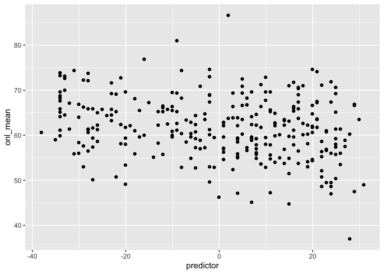
The biggest difference between this and what we did above is that the prior for sigma is exponential rather than uniform. We chose uniform for simplicity, and not because it is a particularly good prior, and exponential is most likely a better choice.
The other rules of thumb we have are met; plausible values of the slope and intercept are within 1 prior standard deviation of the prior mean. And if we note that the mean of an exponential with rate 0.15 is 1/0.15 = 6.666 and its standard deviation is also 6.666, it seems very likely that the true value of the standard deviation is between 0 and 13, so that also meets our rule of thumb.
Compare the prior model for the regression lines to the posterior model for the regression lines.
In this case, we will create a sample of possible slopes and intercepts from the prior distribution, and plot those on the same plot as the data. We will compare that to the sample of possible slopes and intercepts from the posterior distribution.
sim_data_prior <- as.array(update(bayes_model, prior_PD = T))

ggplot(dd, aes(x = age, y = onl_mean)) +
  geom_point(alpha = 0.2) +
  geom_abline(
    slope = sim_data_prior[1:200, 1, 2],
    intercept = sim_data_prior[1:200, 1, 1],
    alpha = 0.3,
    color = "lightblue"
  ) +
  geom_abline(
    slope = sim_data[1:200, 1, 2],
    intercept = sim_data[1:200, 1, 1],
    alpha = 0.2,
    color = "red"
  )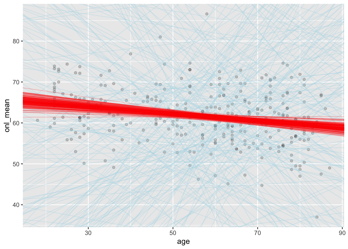
We can see that the priors gave lines that were only weakly plausible, whereas the posteriors gave lines that seem much more plausible when looking at the plot.
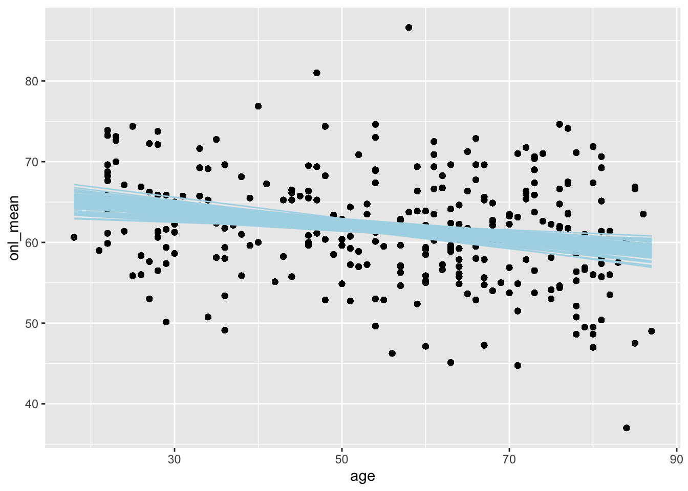
There is another way to get just the posterior lines, which I won’t ever be able to remember, but if you like it better then feel free to use it. We use the add_epred_draws function from the tidybayes package. This gives us posterior predictions for the expected value of onl_mean for the ages in the study.
library(tidybayes)

dd %>%
  select(age, onl_mean) %>%
  add_epred_draws(bayes_model, ndraws = 100) %>%
  ggplot(aes(x = age, y = onl_mean)) +
  geom_point() +
  geom_line(aes(x = age, y = .epred, group = .draw),
    color = "lightblue"
  )
Compute a posterior prediction interval for the mean ONL thickness of a 50 year old patient.
Note that we already did this above in Example 2.3, where we estimated that it was between 48 and 74.5. Now, we can see how to do the same thing using rstanarm. We create a posterior prediction sample using posterior_prediction as follows. If you are familiar with predict from a model created using lm, then this will look very familiar to you.
post_sample <- posterior_predict(bayes_model, newdata = data.frame(age = 50))

head(post_sample)
## 1
## [1,] 66.05398
## [2,] 65.67017
## [3,] 65.14904
## [4,] 56.71400
## [5,] 47.18548
## [6,] 67.78238Now we use hdi to get the posterior prediction interval:
HDInterval::hdi(post_sample)[1]## [1] 49.12849We get 49.1 to 75.3, which is similar to the result that we produced above.
2.2.1 Other tools for accessing sim_data
In this brief section, we talk about the package tidybayes. This package’s goal is to integrate populat Bayesian modeling methods (such as rstanarm) into a tidy data + ggplot workflow. In particular, there is an emphasis on tidy data frames and organizing data in a way that is more natural if you are approaching this having started with the tidyverse.
We assume that bayes_model was created as in Section 2 using the command given below, or with a similar statement using rstanarm.
bayes_model_rstan <- rstan::stan(
  "stan_models/linear_regression.stan",
  data = list(
    y = dd$onl_mean,
    x = dd$age,
    n = nrow(dd)
  ),
  iter = 5000 * 2,
  seed = 4880,
  refresh = 0
)

bayes_model_rstanarm <- rstanarm::stan_glm(onl_mean ~ age,
  data = dd,
  family = "gaussian",
  refresh = 0
)
The first thing we might be interested in is which variables are in the model. We know what variables are in the rstan model, because we named them ourselves:
tidybayes::get_variables(bayes_model_rstan)## [1] "beta0" "beta1" "sigma" "lp__"
## [5] "accept_stat__" "stepsize__" "treedepth__" "n_leapfrog__"
## [9] "divergent__" "energy__"But the rstanarm model isn’t as obvious:2
get_variables(bayes_model_rstanarm)## [1] "(Intercept)" "age" "sigma" "accept_stat__"
## [5] "stepsize__" "treedepth__" "n_leapfrog__" "divergent__"
## [9] "energy__"One thing we see is that the (Intercept) variable has a non-standard name, which is annoying. If we want to extract samples, we can use the spread_draws function, which gives the draws from the model in a tidy format, with awkward names. I think the point of having the names like that is so that they won’t conflict with names that are related to the data, and so that you can tell what type of thing it is from its name. But, I don’t like having weird names that I have to quote, so I am going to use clean_names on it.3
tidybayes::spread_draws(bayes_model_rstanarm, `[\\(a-z].*`, regex = T) %>%
  janitor::clean_names() %>%
  select(intercept, age, sigma)
## # A tibble: 4,000 × 3
## intercept age sigma
## <dbl> <dbl> <dbl>
## 1 66.8 -0.0946 6.73
## 2 66.0 -0.0711 6.63
## 3 66.0 -0.0750 6.42
## 4 65.7 -0.0643 7.02
## 5 64.8 -0.0452 6.81
## 6 68.3 -0.126 6.41
## 7 68.5 -0.130 6.38
## 8 67.5 -0.105 6.34
## 9 65.8 -0.0763 6.38
## 10 68.2 -0.111 6.72
## # … with 3,990 more rowsas.array(bayes_model_rstanarm)[1:5, 1, ]## parameters
## iterations (Intercept) age sigma
## [1,] 66.76177 -0.09456885 6.726276
## [2,] 65.97103 -0.07113509 6.625920
## [3,] 66.04080 -0.07497605 6.421516
## [4,] 65.70508 -0.06433908 7.023683
## [5,] 64.79760 -0.04519116 6.808017So, if we want to compute HDI’s for the three parameters, we could do:
tidybayes::spread_draws(bayes_model_rstanarm, `[\\(a-z].*`, regex = T) %>%
  janitor::clean_names() %>%
  select(intercept, age, sigma) %>%
  summarize(across(.fns = HDInterval::hdi))
## # A tibble: 2 × 3
## intercept age sigma
## <dbl> <dbl> <dbl>
## 1 64.2 -0.128 6.12
## 2 68.8 -0.0497 7.21We can read the three credible intervals off the resulting table. If we want a 99 percent credible interval, it is a bit more complicated:
tidybayes::spread_draws(bayes_model_rstanarm, `[\\(a-z].*`, regex = T) %>%
  janitor::clean_names() %>%
  select(intercept, age, sigma) %>%
  summarize(across(.fns = HDInterval::hdi, credMass = .99))
## # A tibble: 2 × 3
## intercept age sigma
## <dbl> <dbl> <dbl>
## 1 63.5 -0.141 5.98
## 2 69.6 -0.0362 7.39Note that any argument we add to across that isn’t an argument for across gets passed to the function inside of .fns. In this case, it passes credMass = 0.99, which is the way to get HDInterval::hdi to change the credible interval.
If we want a random subset of values from the posterior of the parameters, we can use the n_draws argument.
sim_data <- spread_draws(bayes_model_rstanarm, `(Intercept)`, age, sigma, ndraws = 200) %>%
  janitor::clean_names()
head(sim_data)
## # A tibble: 6 × 6
## chain iteration draw intercept age sigma
## <int> <int> <int> <dbl> <dbl> <dbl>
## 1 1 969 969 66.8 -0.0984 6.58
## 2 3 595 2595 66.2 -0.0804 7.02
## 3 1 551 551 66.2 -0.0820 6.77
## 4 1 539 539 68.1 -0.111 6.52
## 5 4 376 3376 66.3 -0.0795 6.76
## 6 1 266 266 67.6 -0.108 6.41Now we can use this to create a plot of predicted lines:
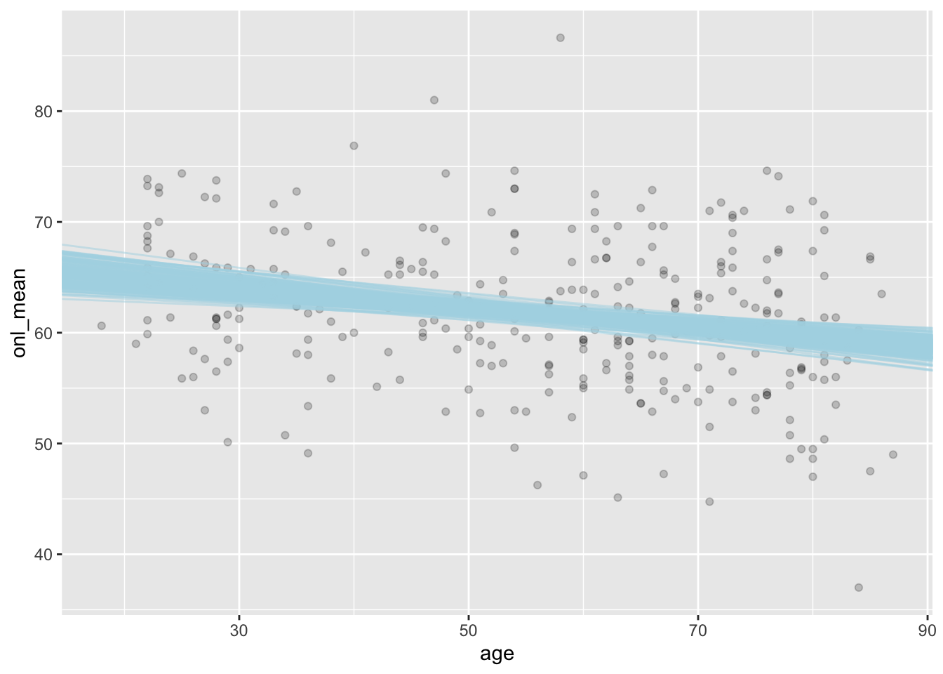
ggplot(dd, aes(age, onl_mean)) +
  geom_point(alpha = 0.2) +
  geom_abline(
    slope = sim_data$age,
    intercept = sim_data$intercept,
    color = "lightblue",
    alpha = 0.5
  )
One thing to notice is that spread_draws creates data in wide format. If we prefer it in long format (for example, sometimes this makes plotting things easier), then we can use gather_draws.4
bayes_model_rstanarm %>%
  gather_draws(`(Intercept)`, age, sigma)
## # A tibble: 12,000 × 5
## # Groups: .variable [3]
## .chain .iteration .draw .variable .value
## <int> <int> <int> <chr> <dbl>
## 1 1 1 1 (Intercept) 66.8
## 2 1 2 2 (Intercept) 66.0
## 3 1 3 3 (Intercept) 66.0
## 4 1 4 4 (Intercept) 65.7
## 5 1 5 5 (Intercept) 64.8
## 6 1 6 6 (Intercept) 68.3
## 7 1 7 7 (Intercept) 68.5
## 8 1 8 8 (Intercept) 67.5
## 9 1 9 9 (Intercept) 65.8
## 10 1 10 10 (Intercept) 68.2
## # … with 11,990 more rowsSo, we can create some plots. For example if we want a density plot of sigma plus a sort of boxplot like interval on the x-axis, we can use stat_halfeye.
bayes_model_rstanarm %>%
  gather_draws(sigma) %>%
  ggplot(aes(x = .value, y = .variable)) +
  tidybayes::stat_halfeye()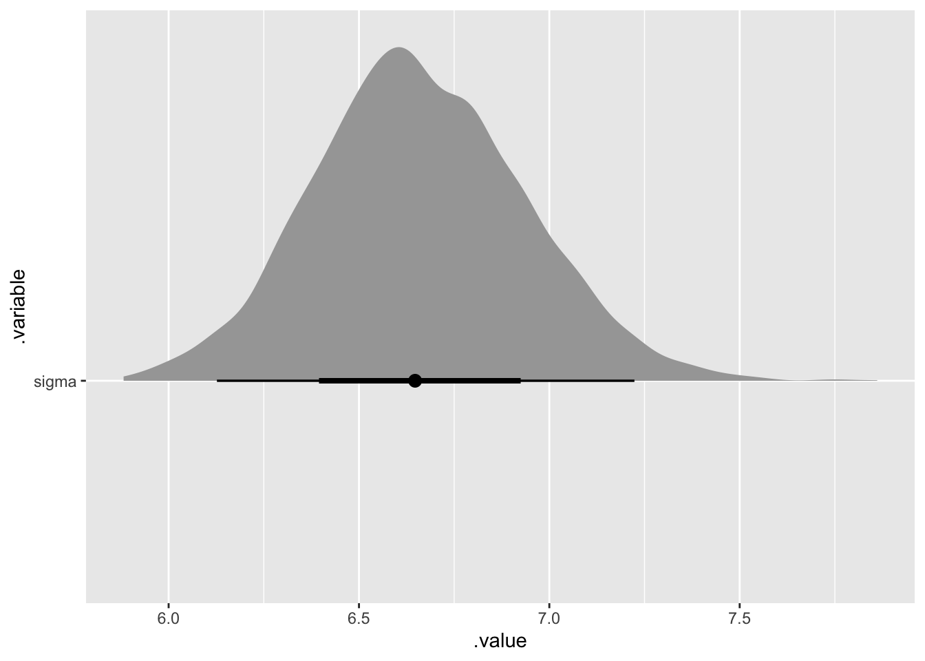
We could also use this with all of the variables, but it doesn’t make sense in this context since they aren’t all on the same scale.
Another interesting thing to do is to create a new data set from our model, and see whether it looks more or less like the original data set. If it does not, then that is evidence that we have mis-modeled our data!
Create a new sample of data from the model.
For this, we use add_predicted_draws, which as the name implies, adds predicted values of the response to the data frame. By default it does it for each draw in the posterior sample, which is really more than we need for our purposes, so we restrict the number of draws to 6.
dd %>%
  select(age, onl_mean) %>%
  add_predicted_draws(bayes_model_rstanarm, ndraws = 6)
## # A tibble: 1,782 × 7
## # Groups: age, onl_mean, .row [297]
## age onl_mean .row .chain .iteration .draw .prediction
## <dbl> <dbl> <int> <int> <int> <int> <dbl>
## 1 28 65.9 1 NA NA 1 60.1
## 2 28 65.9 1 NA NA 2 63.6
## 3 28 65.9 1 NA NA 3 57.9
## 4 28 65.9 1 NA NA 4 49.9
## 5 28 65.9 1 NA NA 5 62.8
## 6 28 65.9 1 NA NA 6 56.7
## 7 27 57.6 2 NA NA 1 57.8
## 8 27 57.6 2 NA NA 2 68.6
## 9 27 57.6 2 NA NA 3 75.5
## 10 27 57.6 2 NA NA 4 64.9
## # … with 1,772 more rowsIf we want to create a scatterplot, we can do the following and see whether it looks more or less like the original data. It does, more or less, so we don’t have compelling evidence that we have mis-modeled our data.
dd %>%
  select(age, onl_mean) %>%
  add_predicted_draws(bayes_model_rstanarm, ndraws = 6) %>%
  ggplot(aes(x = age, y = .prediction)) +
  geom_point() +
  facet_wrap(~.draw)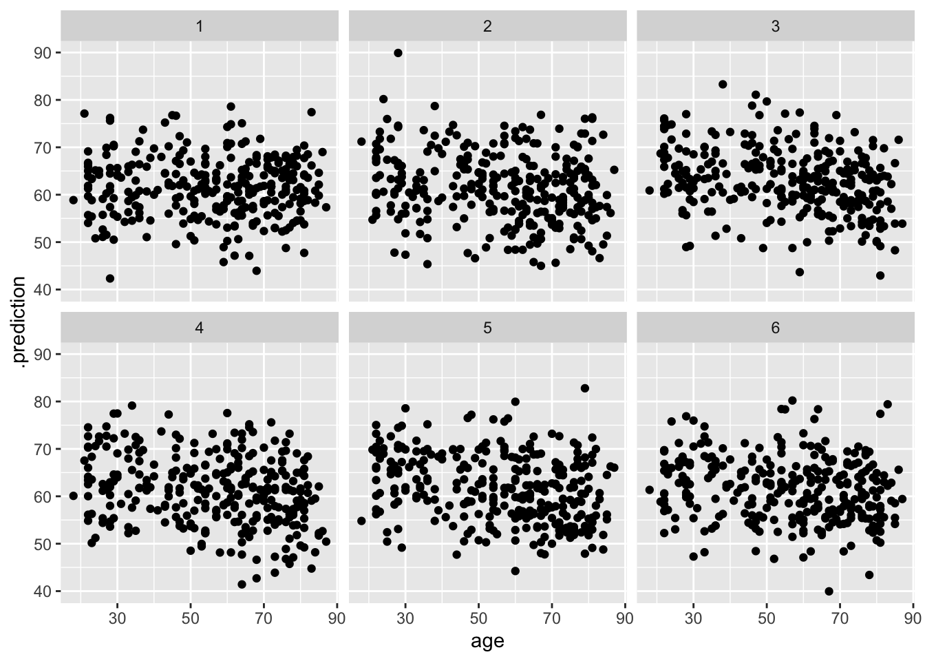
2.3 Some theory (for the grad students)
2.4 Exercises
From Section 2.1. Consider the penguins data set in the palmerpenguins package.
- Use a weakly informative prior to simulate the normal regression posterior model of
body_mass_gonflipper_length_mmfor chinstrap penguins. - Create a scatterplot of
y = body_mass_gversusx = flipper_length_mmfor chinstrap penguins, and overlay 500 posterior model lines. - Create a 95 percent credible interval for the slope.
- Do we have ample evidence to conclude that chinstrap penguins with longer flippers weigh more?
- Suppose you measure a penguin and determine its flipper length is 52 mm. Calculate and interpret an 80 percent posterior prediction interval of body weight for this specific penguin’s length.
- Calculate and interpret an 80 percent credible interval for the typical body weight of a penguin with flipper length of 52 mm.
From Section 2.2. Repeat Exercise 2.1 using rstanarm, and compare your answers to what you obtained in the previous problem.
From Section 2.2. Provide a visualization of the prior distribution of regression lines which rstanarm chooses by default for the penguins data set, as in Example 2.6.
Consider the Davis data set in the carData package. We are interested in determining the relationship between the reported weight of patients and their actual weight.
- Create a scatterplot of
weightversusrepwt. Does it appear that the relationship is plausibly modeled by a line plus normally distributed error? - Use
rstanarmto create a of \(y = \beta_0 + \beta_1 x + \epsilon\), whereyisweight,xisrepwt, and \(\epsilon\) is normally distributed. - Find a 95 percent credible interval for \(\beta_1\) and perform a hypothesis test of \(H_0: \beta_1 = 1\) with a ROPE of \([.95, 1.05]\).
- There is one extreme outlier. Look at the data set and speculate what happened. Normally, we would remove or correct this data point before continuing since there is an obvious explanation for what happened. But, suppose we are automating this and no human ever closely examines the data, or there is a case that isn’t as clear whether it should be removed. Parts e and f provide one suggestion for how to proceed.
- Modify the technnique in Section 2.1 to model \(y = \beta_0 + \beta_1 x + \epsilon\), where \(\epsilon\) is \(t\) distributed with mean 0, unknown scale and unknown degrees of freedom, see here.
- From your mode in (d), create a 95 percent credible interval for \(\beta_1\) and perform a hypothesis test with a ROPE for \(\beta_1\) of \([.95, 1.05]\).
My convention is that I try to use the
package::functionnotation the first time I use a function in a chapter or section, if I think it is an unfamiliar function. After the first usage, I try to switch to just the function name and assume you have runlibrary(packagename).↩︎This is probably a mistake. I haven’t used this function enough to really recommend this; I am sure the authors have good reasons for the names.↩︎
The reason for these names may be that there used to be
dplyrfunctions calledspreadandgather, which do whatpivot_widerandpivot_longernow do.↩︎